|
|
|
my plan for unit 2.
|
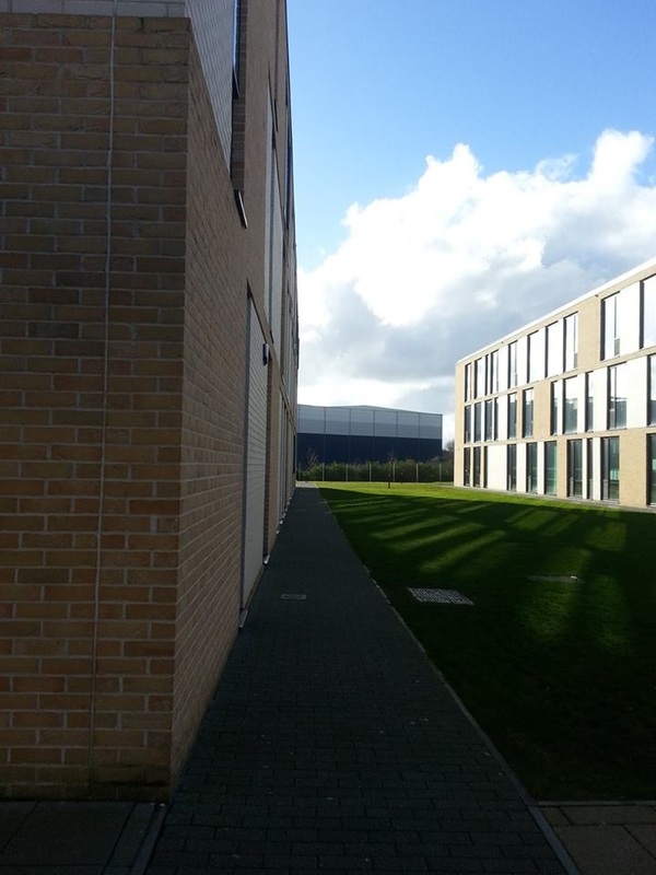
My starting point; 'Edges'.
Laura Latynski uses the edges of objects such as tables and shelves and the line where one colour meets another as important features of the composition in her still-life photographs. Jed Devine and Jan Groover use similar compositional devices in their work. Lines formed by the edges of parts of buildings, shadows and silhouettes are an important part of the composition in the photographs and photograms of Laszlo Moholy-Nagy.
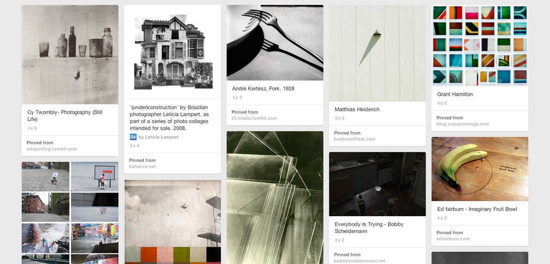
I have selected the theme Edges. I've chosen this because It's linked to still life and that's something I'm quite interested in, I also do still life in Art and design and I have already experimented with still life and how it works.
I have looked up photographers; Laura Latynski, Jed Devine, Jan Groover.
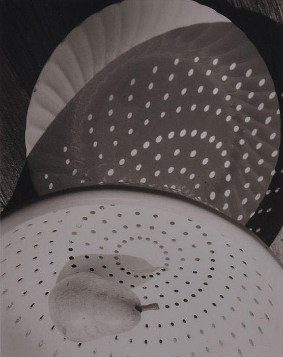
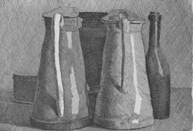
Jan Groover is my favourite because his work is quite simple and I really like the way that he uses kitchen tolls like; Knifes and folks, simmers, spoons. He also has everyday usage, things like bottles, salt and pepper pots and have random fruits around it like bananas, or just a lot of different fruit. I really like this idea, it has a range of different things involved like reflection, edges and different shapes and sizes.
I have looked up photographers; Laura Latynski, Jed Devine, Jan Groover.
Jan Groover is my favourite because his work is quite simple and I really like the way that he uses kitchen tolls like; Knifes and folks, simmers, spoons. He also has everyday usage, things like bottles, salt and pepper pots and have random fruits around it like bananas, or just a lot of different fruit. I really like this idea, it has a range of different things involved like reflection, edges and different shapes and sizes.
jAN GROOVER.
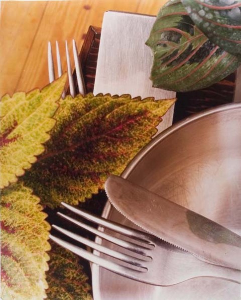
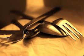
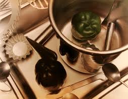
This is Jan Groover, I find their work quite interesting because they used cutlery in their pictures. Focusing on the different types of edges their are, I would like to try out something like this only because it's an everyday thing that we all use, like knifes and folks etc.
It also focuses on the different textures and colours and reflections, that is something I would like to try out. I find with the fruit and bread in one of his photographs it makes the picture more forward, because we use cutlery to cut and to spread.
It also focuses on the different textures and colours and reflections, that is something I would like to try out. I find with the fruit and bread in one of his photographs it makes the picture more forward, because we use cutlery to cut and to spread.
LAURA LATyNSKI
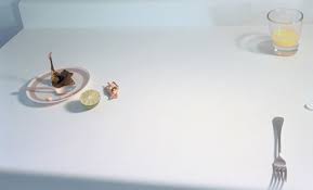
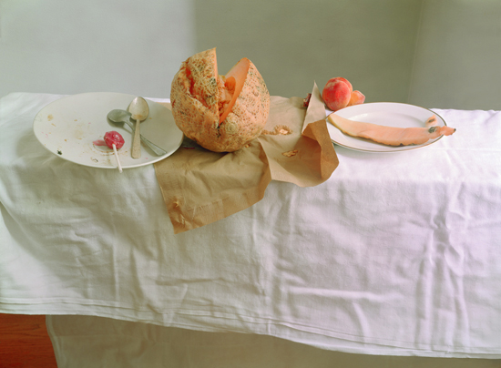
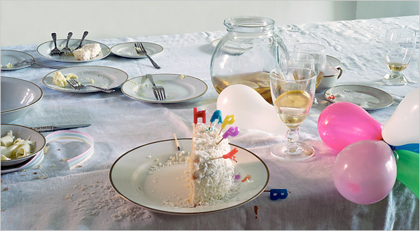
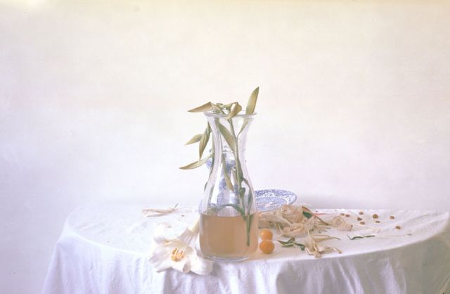
Laura Latynski is my favourite photographer, In regards to edges. Edges are seen as still life and with the still life theme she has used foods with her work, her pictures are inspiring for so many different reasons, whether you're just focusing on edges or still life (food). Or maybe even colour. I would like to aim to work around Latynski's work, I really like the white effect going on in her pictures, it gives you some kind of unknown emotion so I really like that!
Jed devine
Jed Devine is very different in the scheme of edges, It's not based on any particular edges, It's based on edges of everything... Houses, windows, buildings, simmer, tables chairs, there is not a particular style to his work. Devine also focuses on effects, Devine uses a vintage effect which I think draws the attention to the pictures making it more interesting, It makes it more eye catching with the reflecting and lighting.
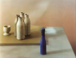
GIORGIO mORANDI.
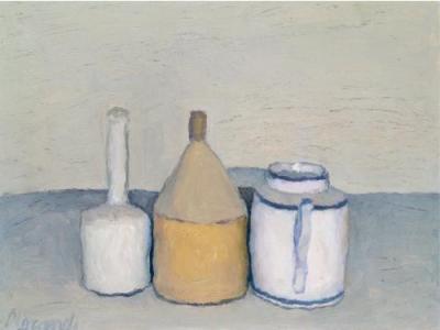
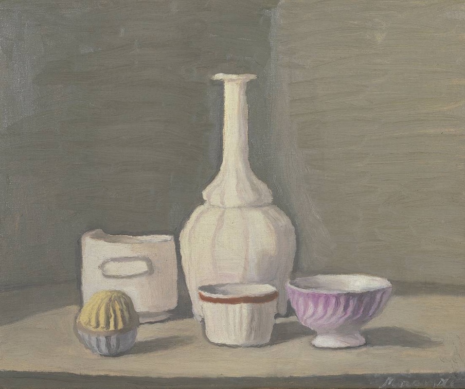
I really like Giorgio's work, some of his work is drawn and used oil pastels etc. I like the shadows and light that he uses as a reflection on the jars and jugs, which makes the picture look real. My favourite picture is the black and white one, it looks as if he's used a pencil for it and it really works, especially with the shadows. Where the jars and bowls are painted work well with the backdrop and the table its on... With the shadows and shading it brings this real life vintage old kind of vibe rather then new modern real life photography with natural lighting, With the painting, chalk, pencil it's a drawing by hand and by sight which is more interesting.
Richard long.
A preview of Richard Long and information on him and his background...
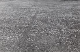
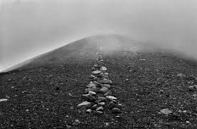
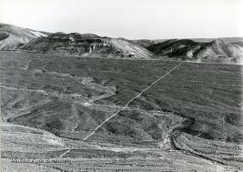
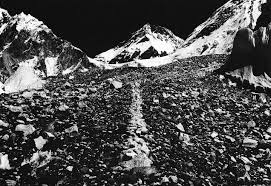
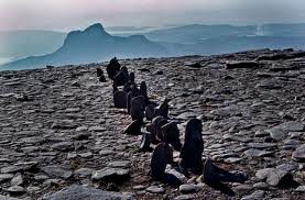
This is Richard Long's photography and his sculpturing, he works on lines; When maybe he goes on walks he will stack of rocks in lines and photograph them, he even in-graves lines into the ground,or uses some kind of spray paint or something. It's a very inspiring idea and I would love to try out something similar to this. Would like to try it out with something rather then stone etc, maybe dig a long line in the grass in a felid somewhere or on a gravel path make a long line in the stones.
Doris sALCEDOÒ≥
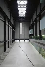
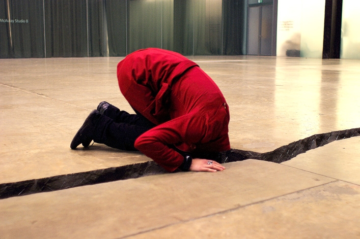
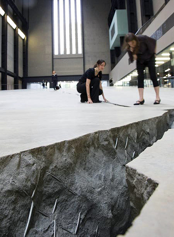
In the Tate modern Doris used a room with a massive crack in the middle, she uses it to represent her and her culture as a jew because of there separation between jews and other people, and wanted to make it clear on what its like and how jews feel. A lot of people are really interested in her work and are inspired because of this massive crack and the story behind it. This wouldn't be something I could try out, unless I saw a crack in the ground or even a wall I could always focus on that by photographing cracks whenever I see them.
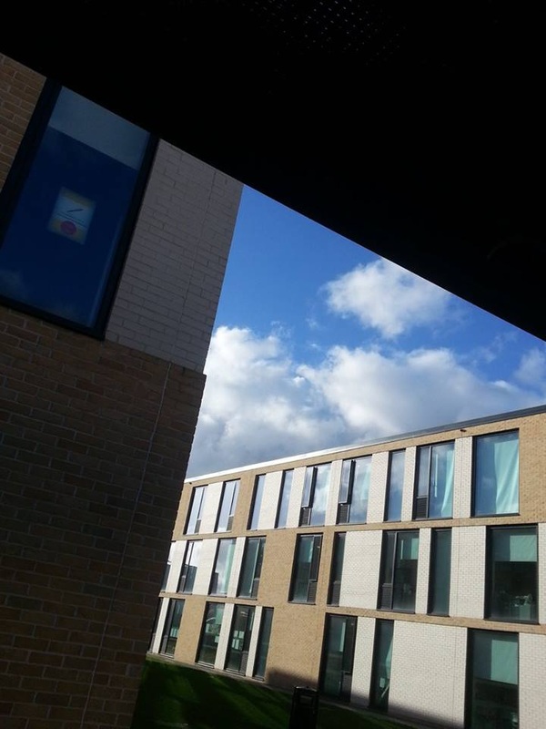
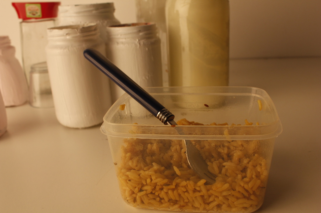
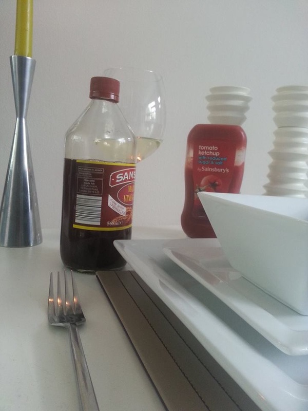
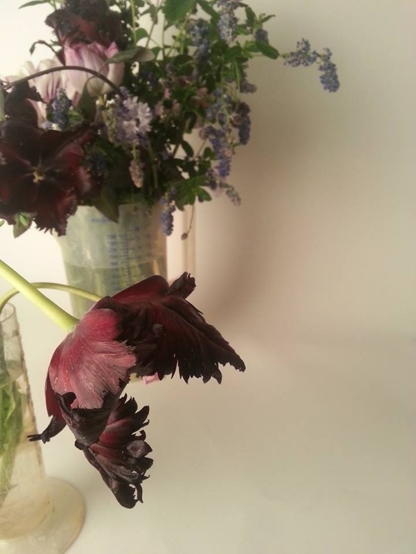
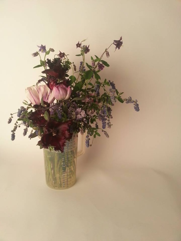
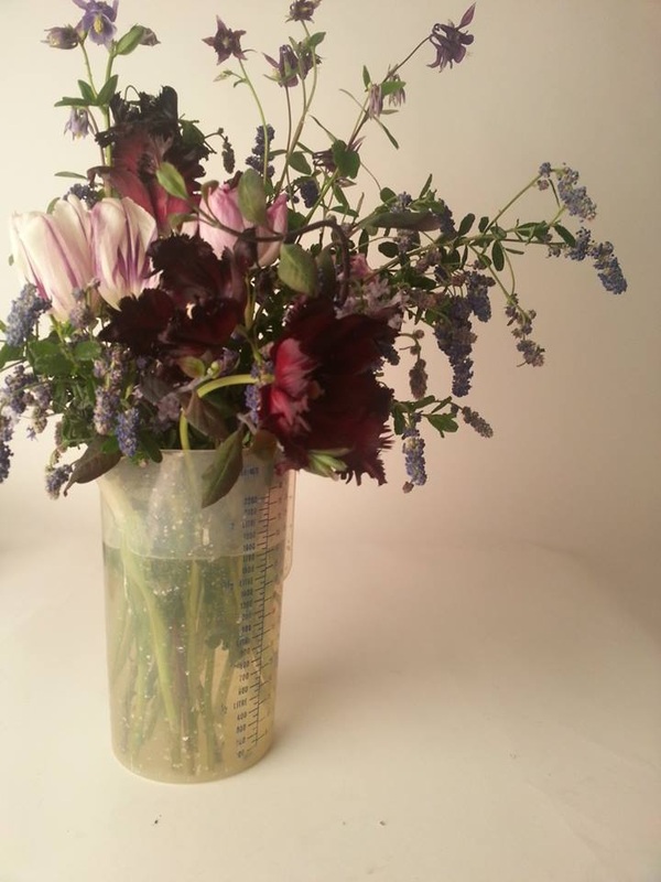
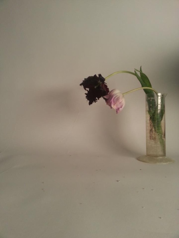
Here are some pictures that I have taken, just testing out the different types of edges, I've used edges outside and some of just objects. This was just a tester on what edges are like, just to get me started. These are not the kind of pictures that I would want to take for my edges, because it seems to simple and boring.
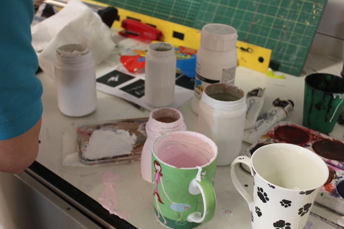
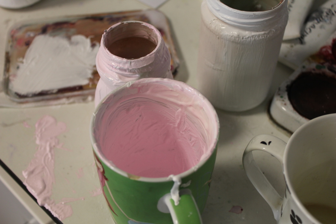
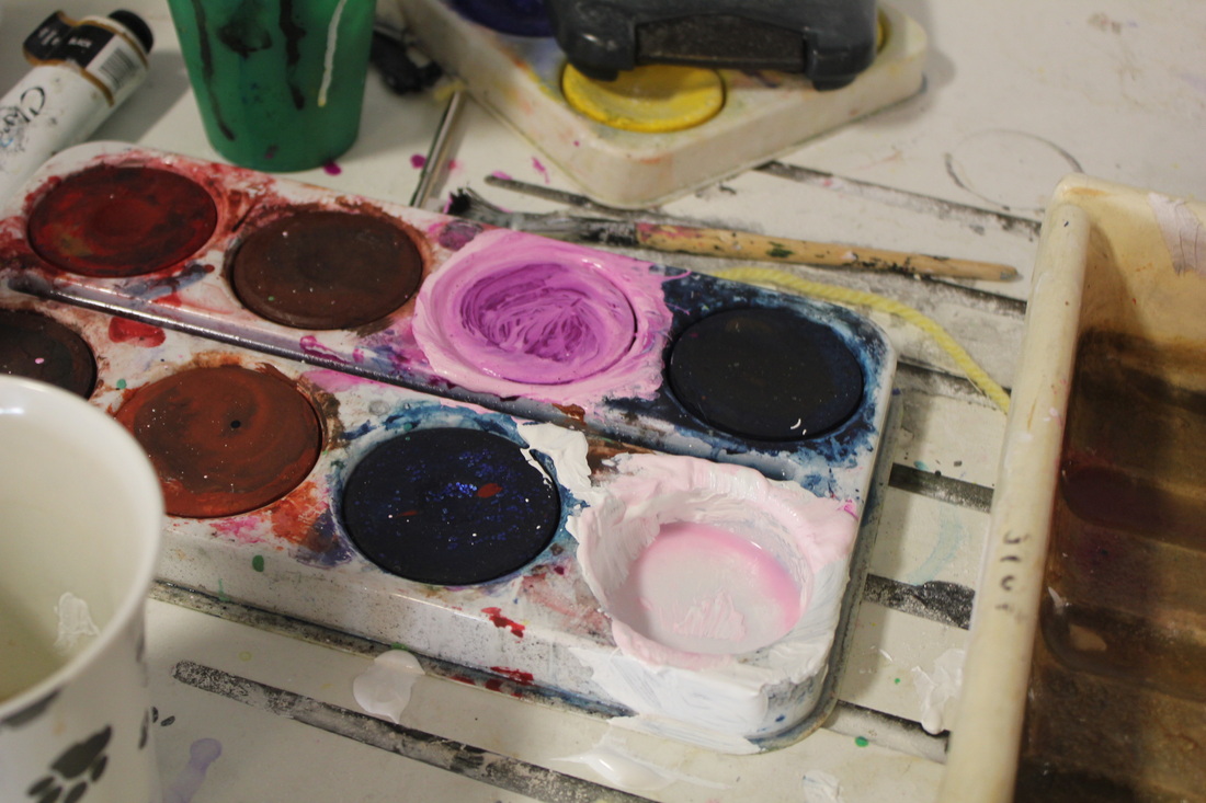
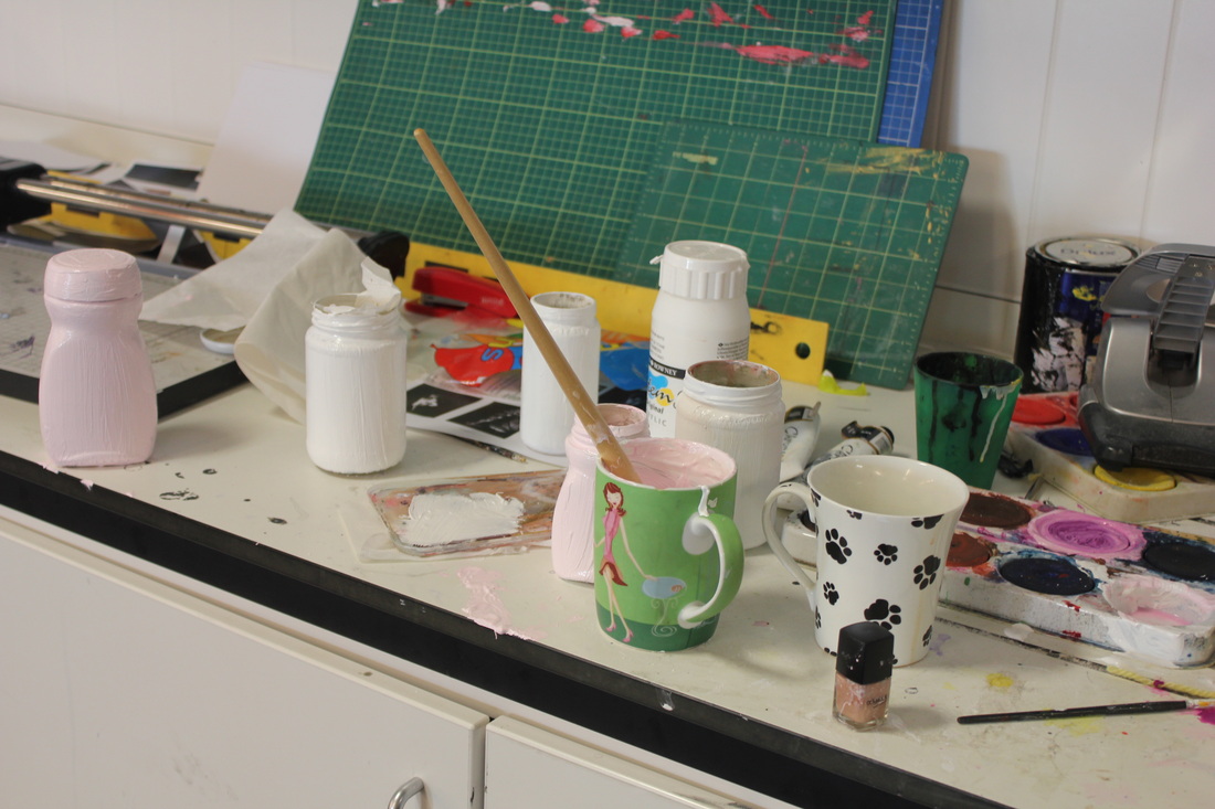
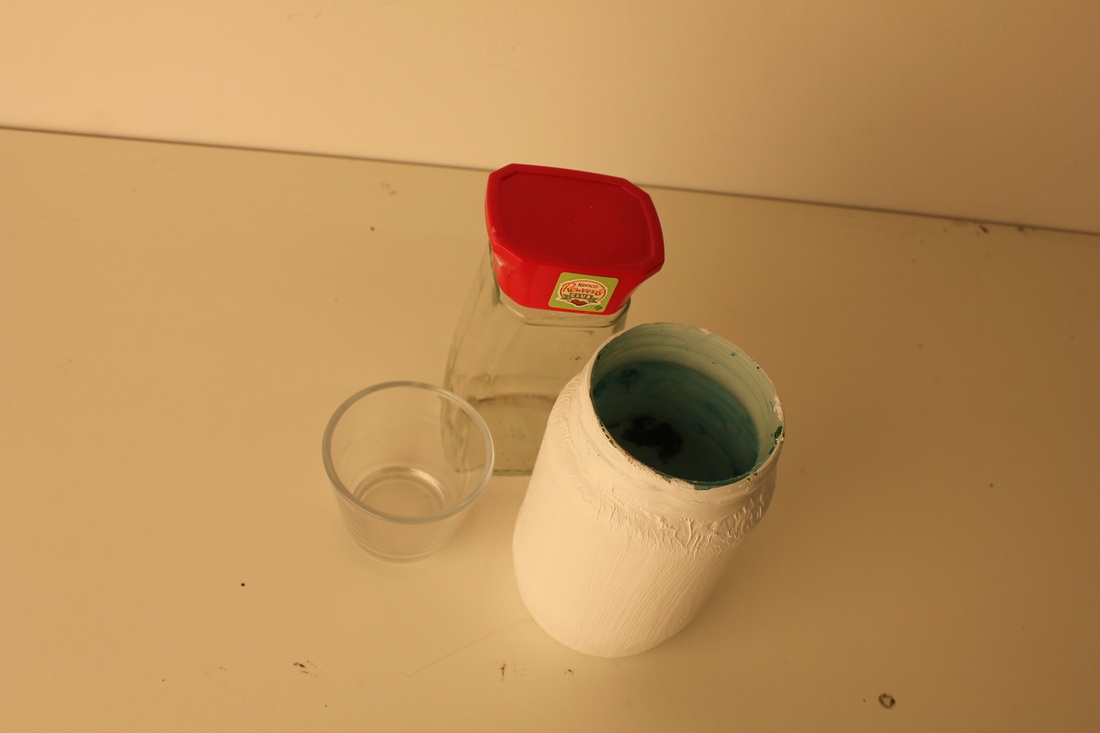
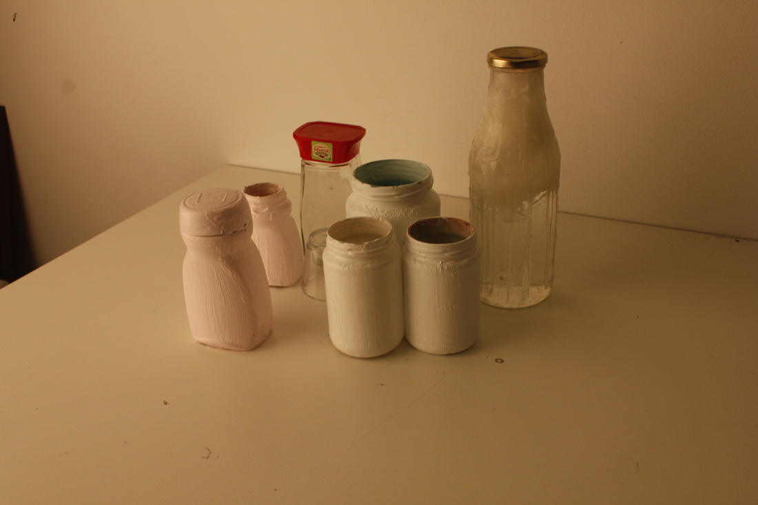
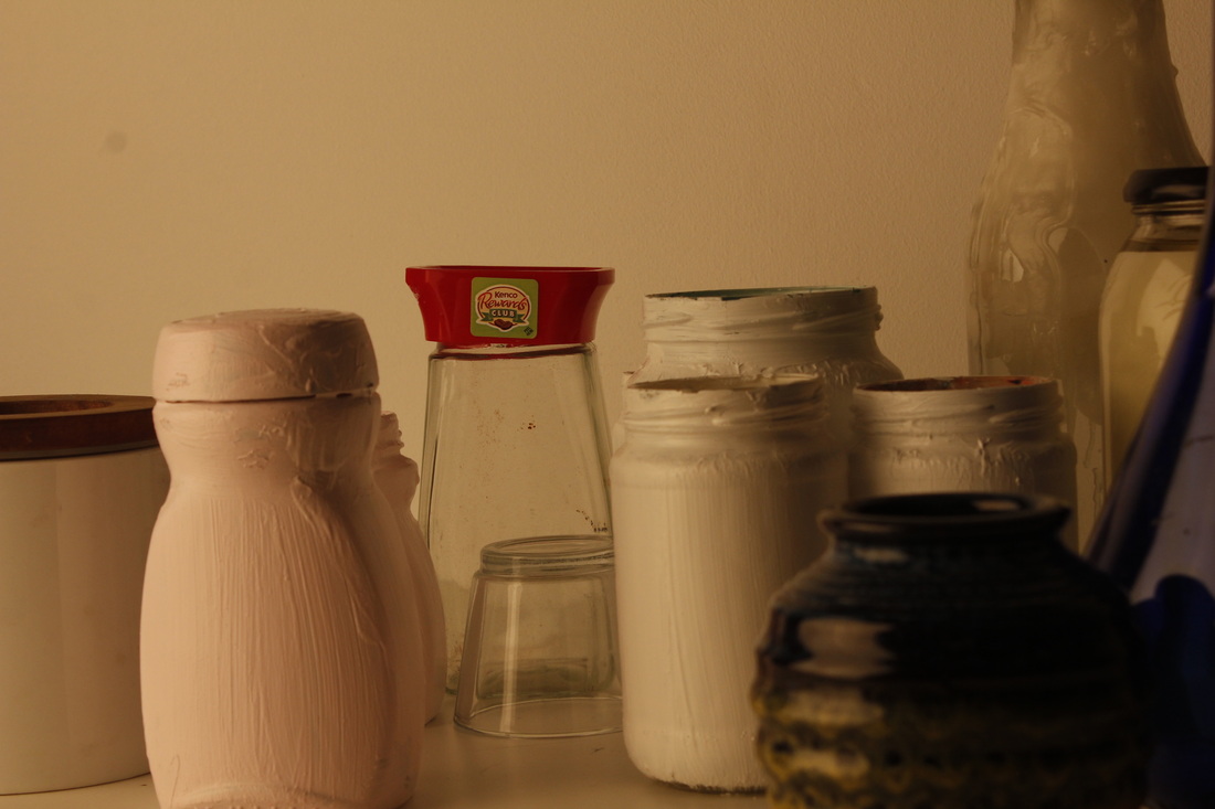
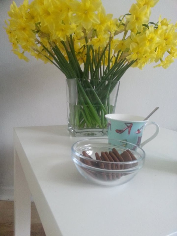
I collect loads of pots and jars, i painted some of them, and collected some from home and around the school.
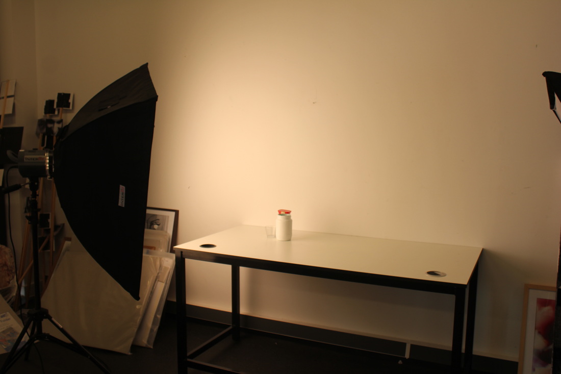
I painted them a light pink and some white, thought it might have needed a nice tint it because white and plain glass can be rather boring. I used show lights and natural light from through the window, I placed then in the back corner of the table rather then the middle or right at the edge, this is so that I can get many different shades of light and shadows in different places.
I painted them a light pink and some white, thought it might have needed a nice tint it because white and plain glass can be rather boring. I used show lights and natural light from through the window, I placed then in the back corner of the table rather then the middle or right at the edge, this is so that I can get many different shades of light and shadows in different places.
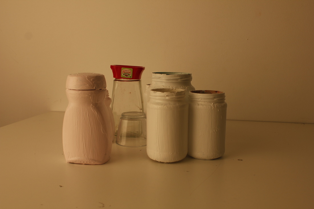
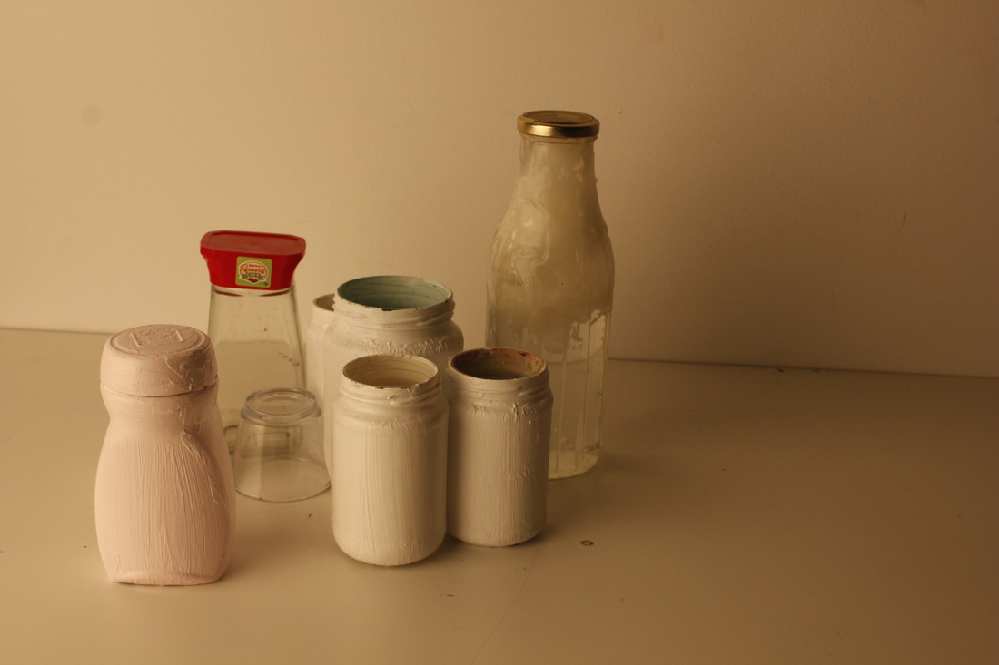
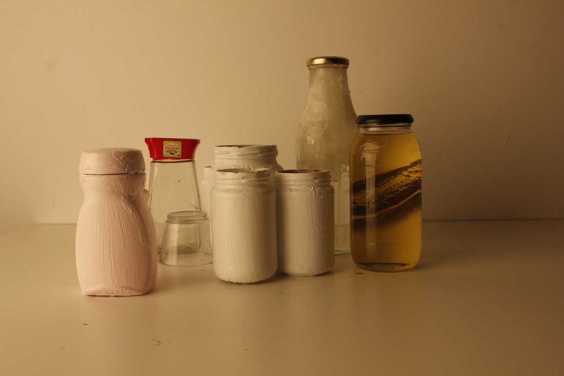
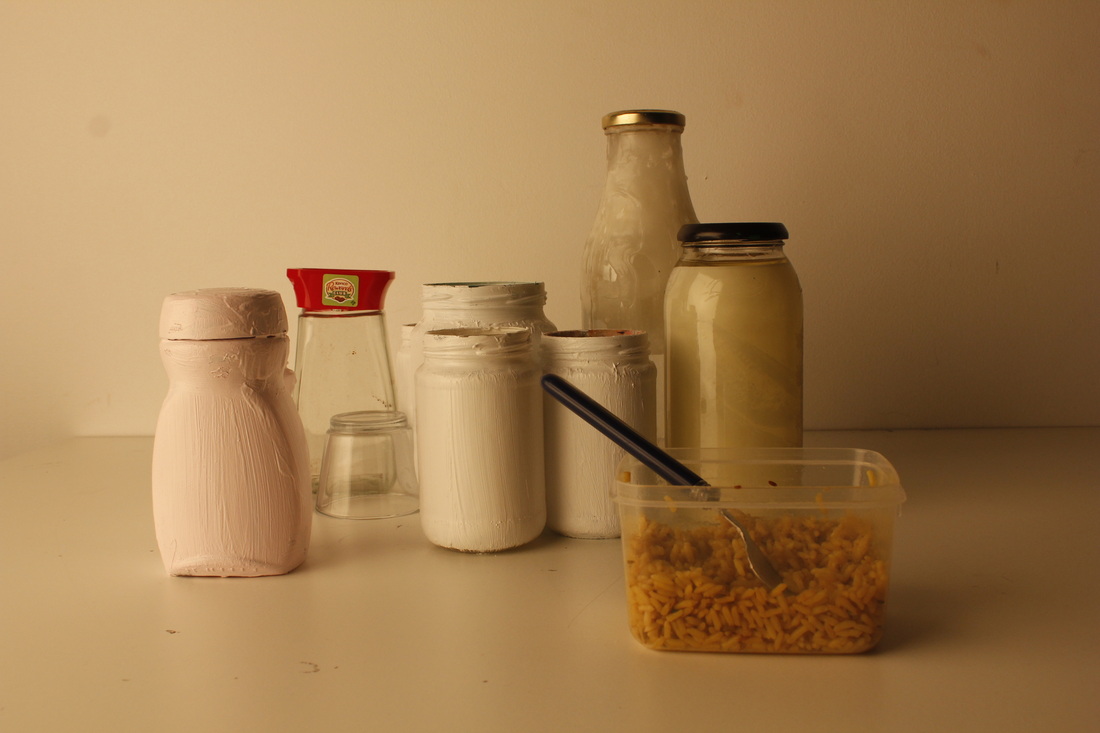
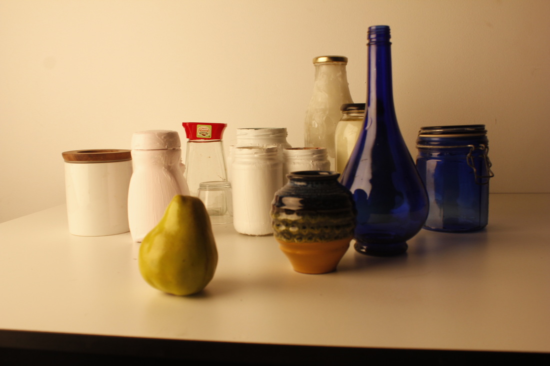
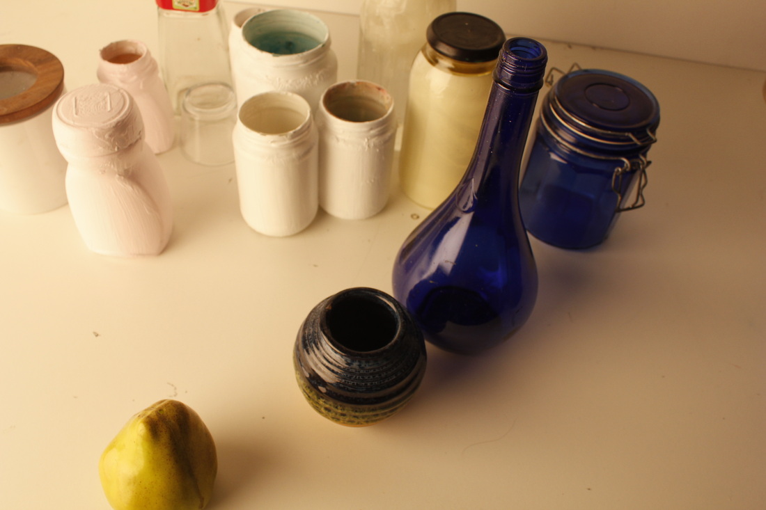
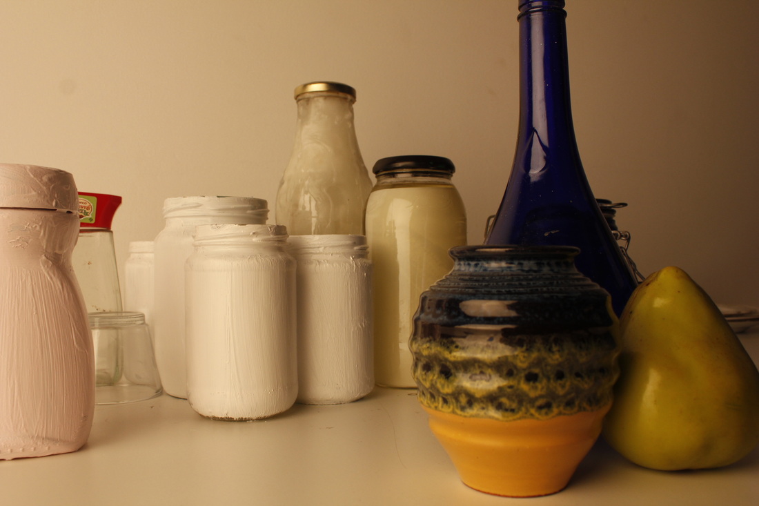
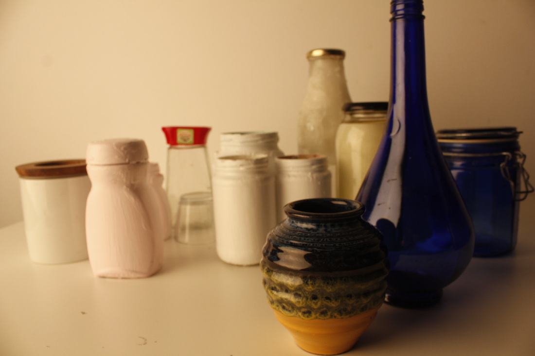
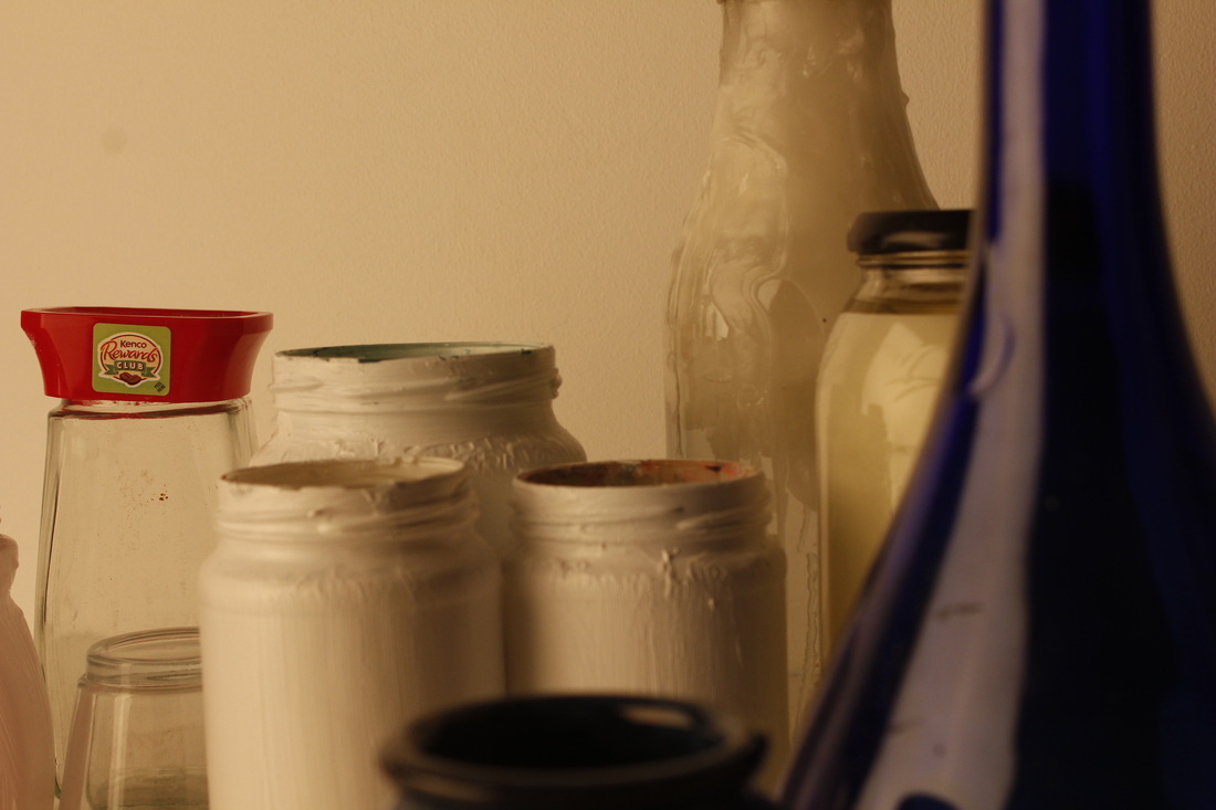
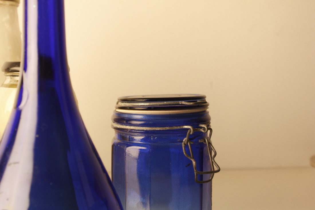
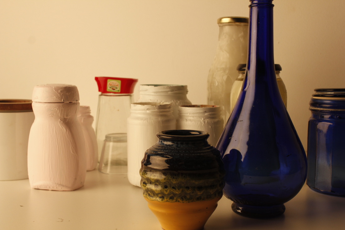
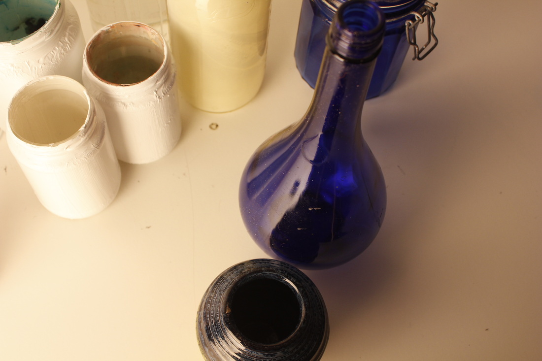
These are my pictures that I have taken, They didn't go as well as I wanted it to go. The painted jars really don't work well, the paint looks awful and doesn't look realistic and thats not what I was hoping for, i'm hoping to come up with a new idea and choose a different idea for edges because this isn't something I'm confident of making progress with. Some of the pictures I have taken I really like, I love the blue bottles/jars against the white jars, the background is kind of a cream shade and It makes the shadow on the blue bottle contract with the background. The edges and shapes are very clear the shadows on them fade the edges slightly which really works out!

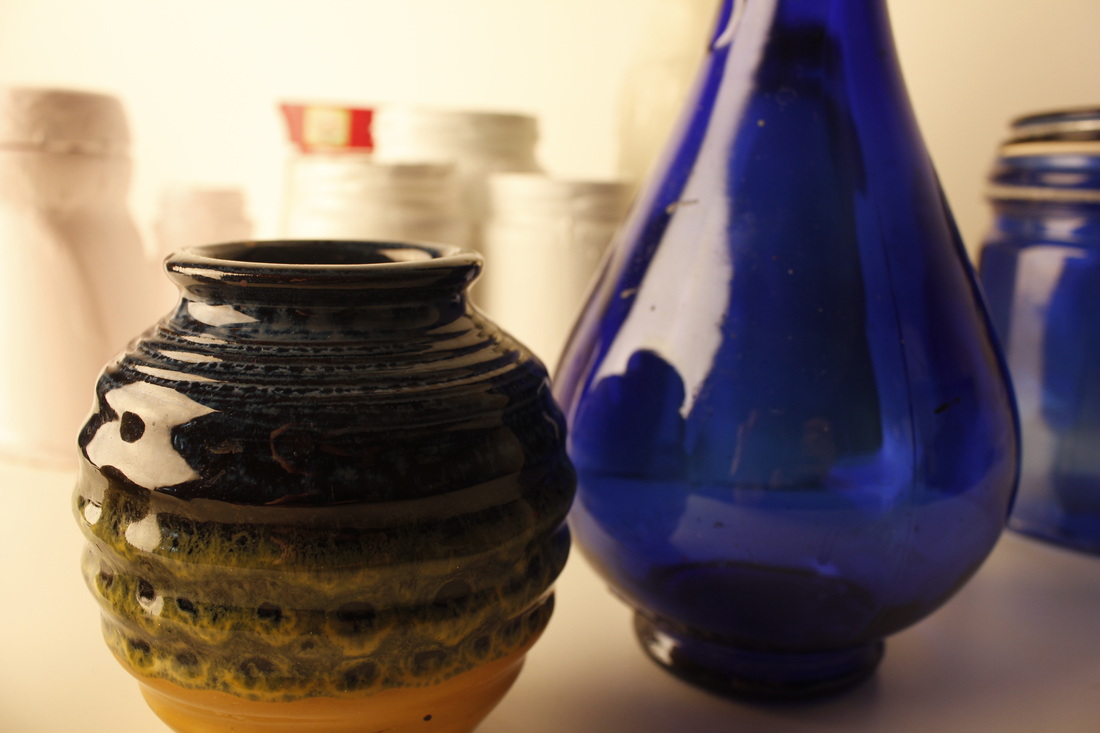
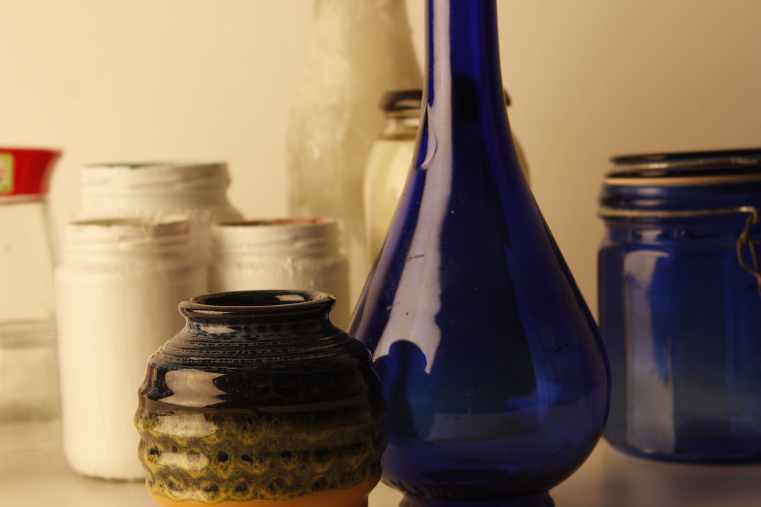
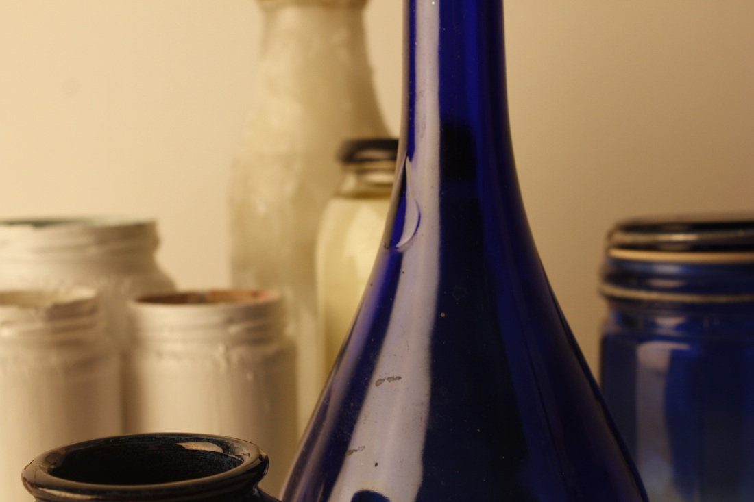
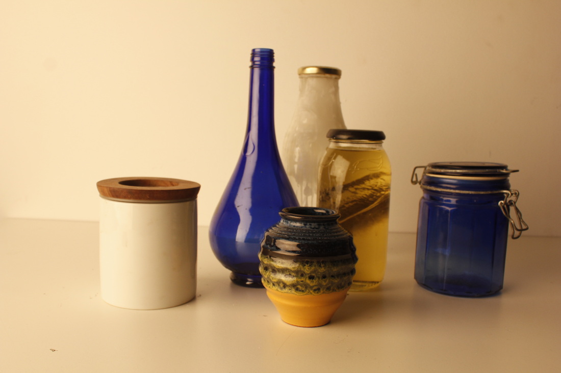
I REALLY like this one, the lighting really works with the shadows and reflect well with the light, this is the only picture that worked to how I wanted it. The blue with the creamy tanned background really works because it makes it really stand out, I would like to carry on experimenting with these blue jars and vases. The light on the jars match a lot with the background colour as its the light thats shining and it look more interesting as the jars are Dark Blue. The colours of the metal of on the jars are also round about the same colour or it's much darker, like a greyish/brown colour, but I think it's contrasting.
pHOTOSHOP.
ORIGINAL.
This is the photo that I took before I had edited it on photoshop, as you can see the colours are not very eye catching it's quite bland and the shading isn't as clear as it could be. The lighting is quite dim, and the same, which is why photoshopping it is the best option.. The colours of the jars don't really stand out that much and doesn't look as if it has natural light.
|
pHOTOSHOP'.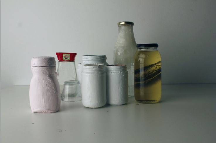
This is the edited picture which I edit on photoshop, this picture is a better quality because it looks as if it has its natural light which I really like, the colours of the jars really stand out and its cleat to see what they are and the detail and shading show much clearer, the shadows of the back drop look more natural and just looks more of a better picture. I really like this edited version and has given me ideas about what kind of light I should use when I take pictures for my final photos for unit 2.
|
Explaining how i used photoshop to edit my photo!
|
|
Before starting my edit, I chose a photo which I had taken and what I thought would look better edited, I chose this photo because the I really liked the colours and the shadows.
First off..
First off..
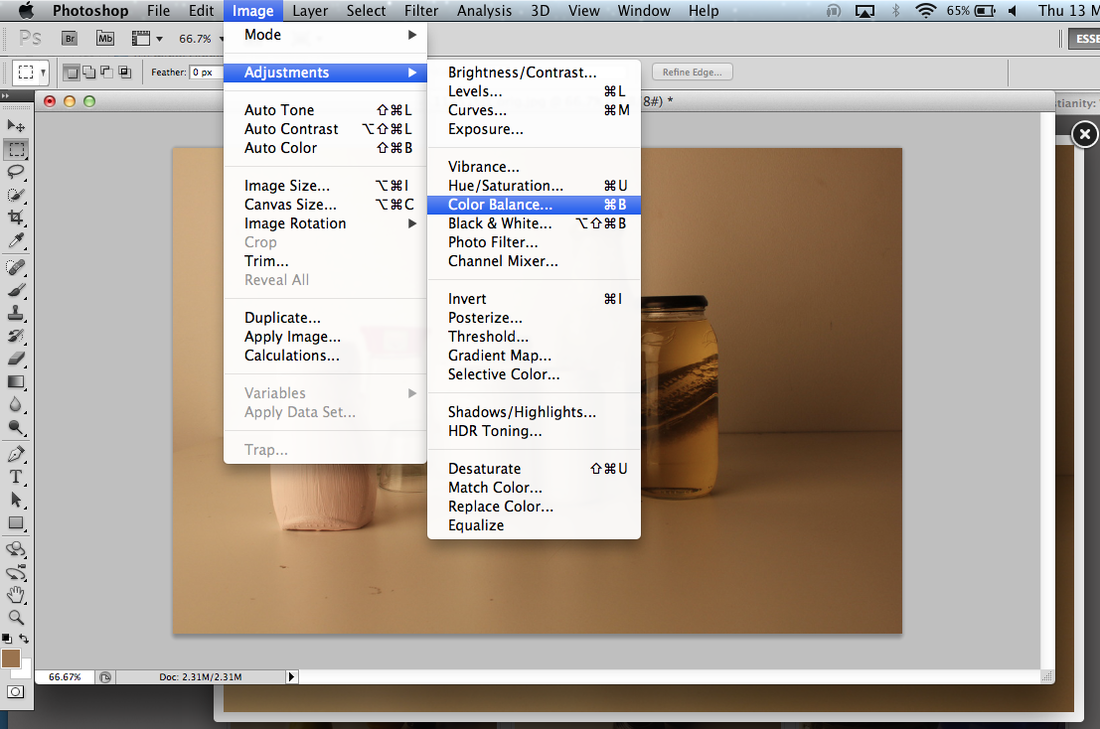
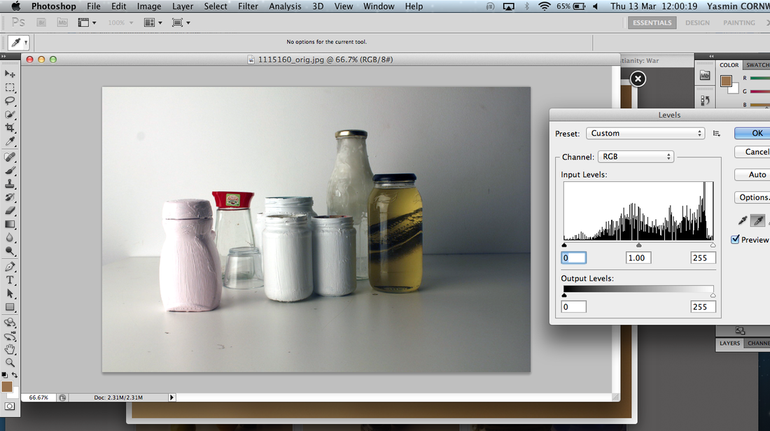
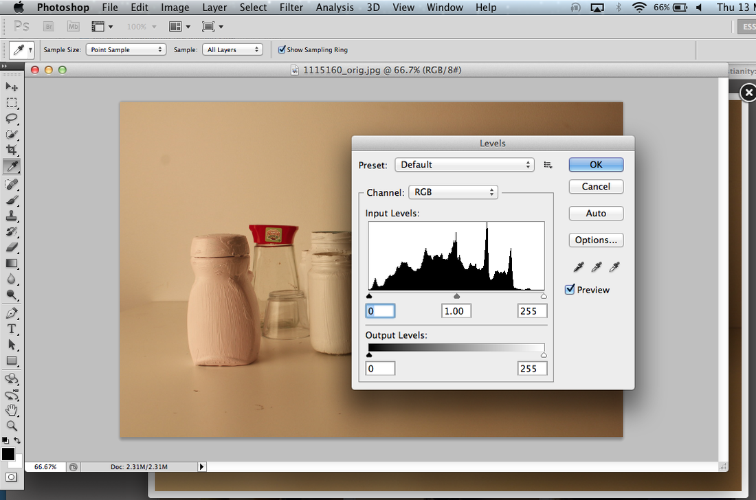
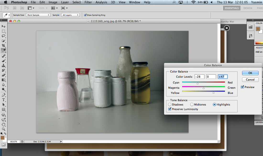
- I clicked on 'image' on the top option bar, I went on 'Adjustment' and chose 'colour balance'.
- It then came up with with this tab called 'levels' - This is so I can turn contrast up and down whether I want it to be brighter or more of a darker colour, It also has another opinion whether I want to give the picture a bit of tint of colour, I used the mixture of blue grey and navy, with the contrast as well it came out like in the image above.
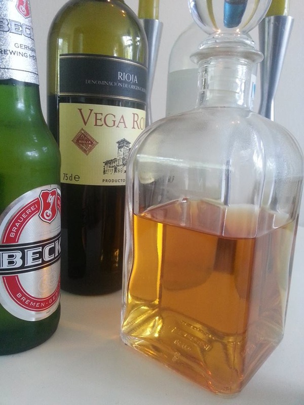
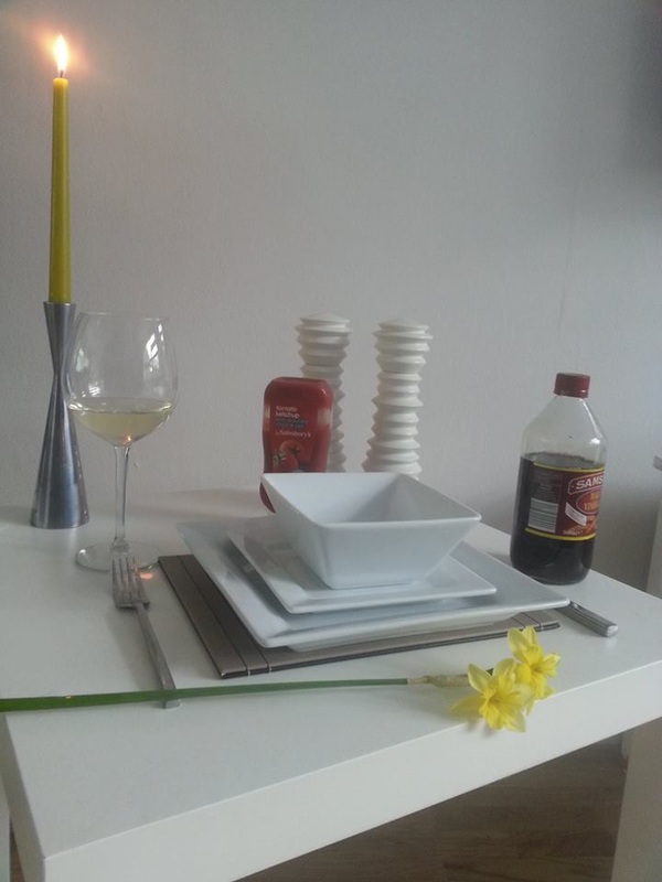
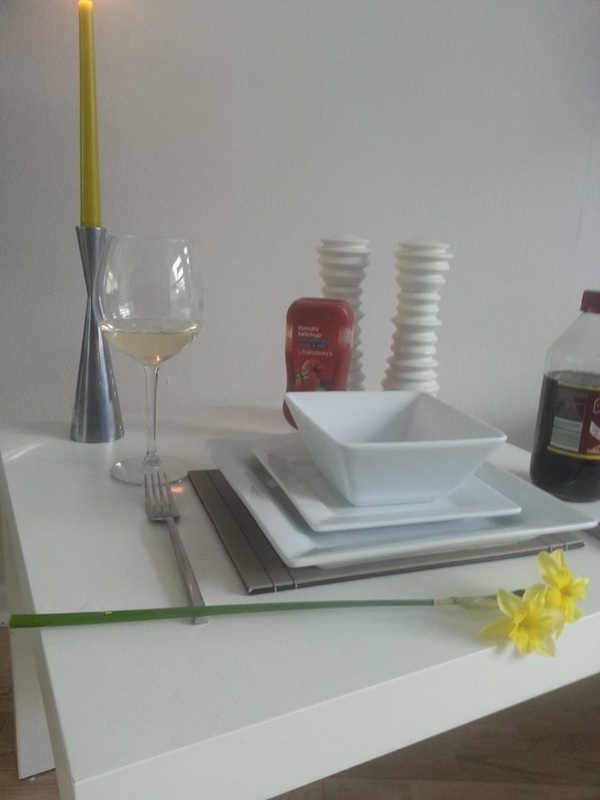
My next step is to take more photos, I would like to take pictures in the way Laura Latynski does as I really like the way she takes her photos, I will be working around the same way as before, as I'm working with edges I liked to jars idea, I may use other kitchen equipment as well as jars. Maybe use things like knifes, folks, bowls, plates, glass cups, maybe might even use some wine in the glass as the colour will really stand out in the pictures and once I've photoshopped them it would look really good.
Plan on what kitchen equipment to use for my final unit.
- Chopping board.
- Wine glass - With wine.
- Plates.
- Bowls.
- Knifes


Photoshopping my photos.
|
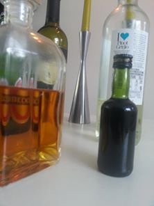
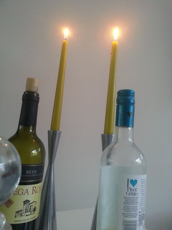
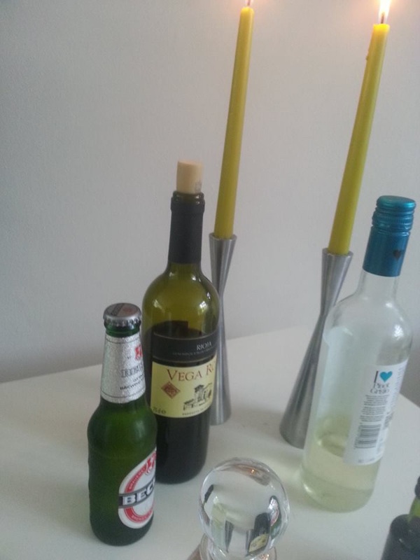
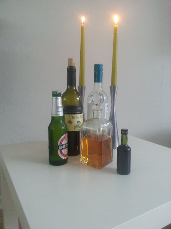
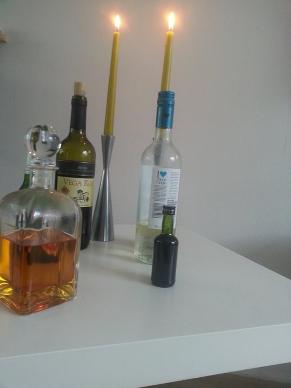
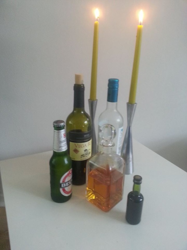
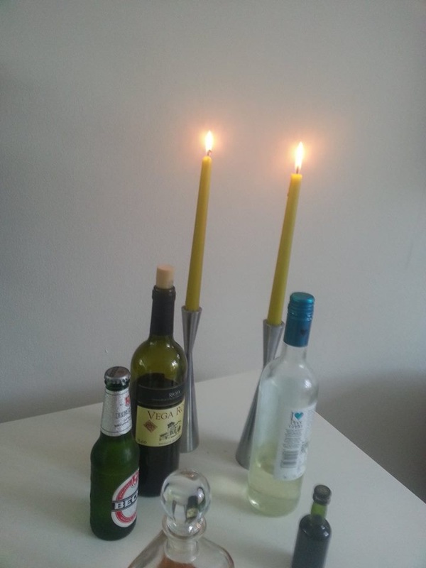
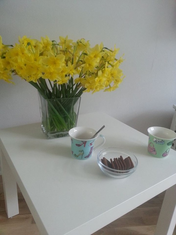
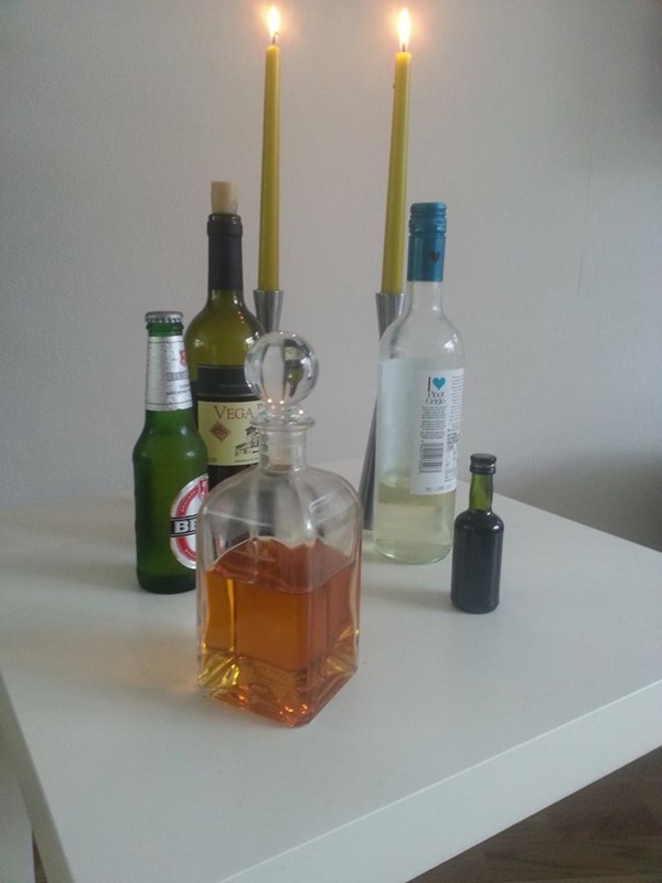
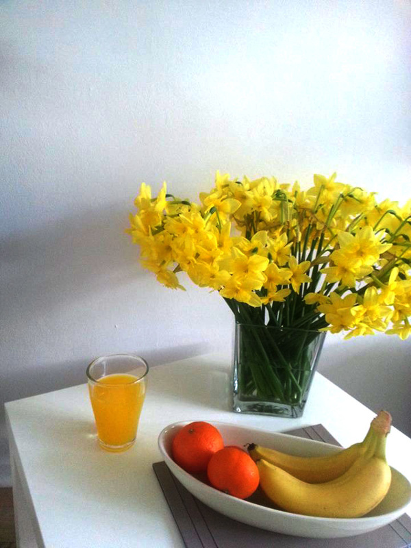
This is one of my favourite pictures that I have taken with vine and beer bottles, I like all the colours and the way that the light shines on the bottles and the contrast of the white table and white walls which makes a clear view of the edges and the shadows. I edited this picture on photoshop and put the contrast and brightness up making the white a little more clearer, the brightness brightens up the light reflected and brings out the colours even more which looks good, especially with the orange and the lit candles.
To improve: I would maybe I would lower the brightness and the contrast a tad - I'm not very good at using photoshop. |
Levels: How I contrasted the shadows and colours.
|
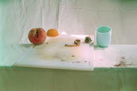
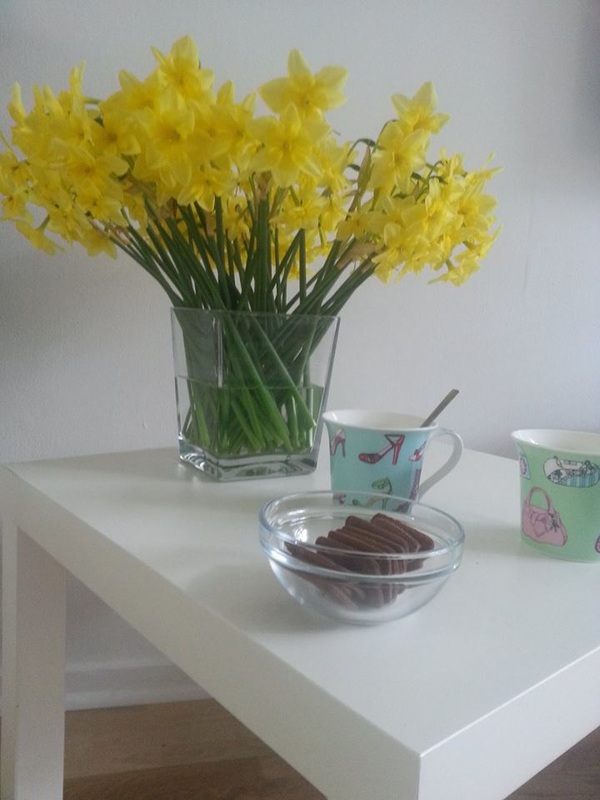
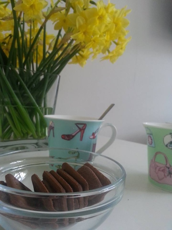
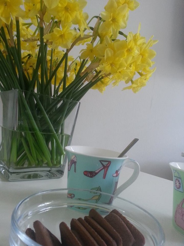
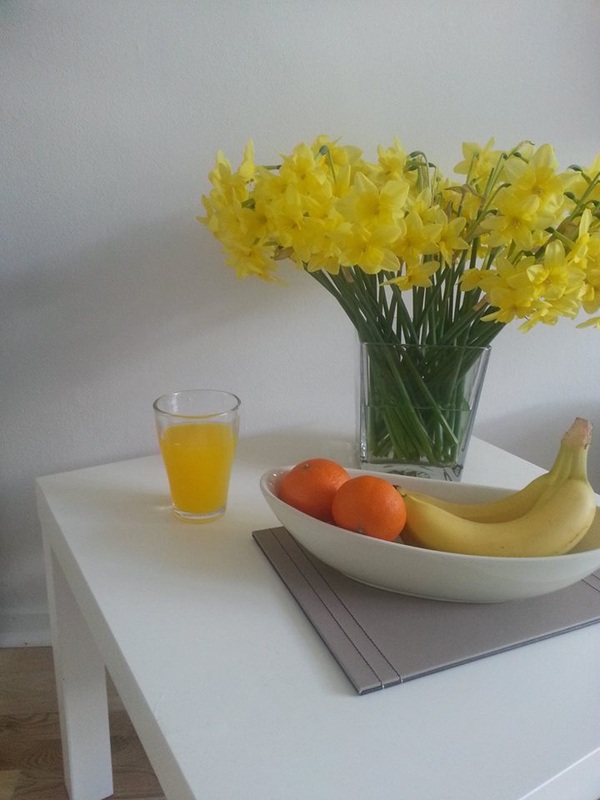
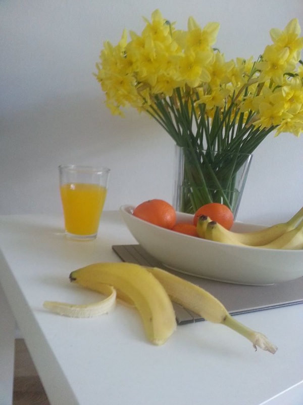
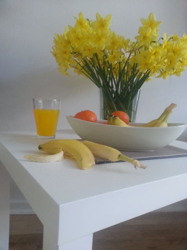
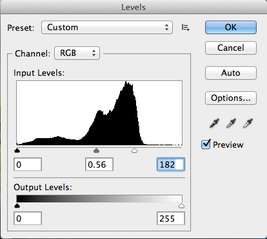
This is my favourite fruit picture, I like the different colour yellows and the contrast of the orange and green involved in the picture.
With the photoshopping of the photo It brings out a really nice texture which brings out the edges really nicely, the colour and the light are beautiful and the shadows of the flowers and the cup make everything seem alive. |

|
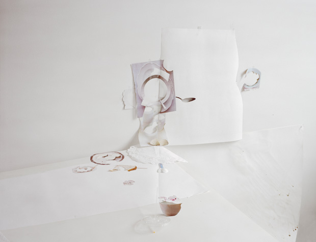
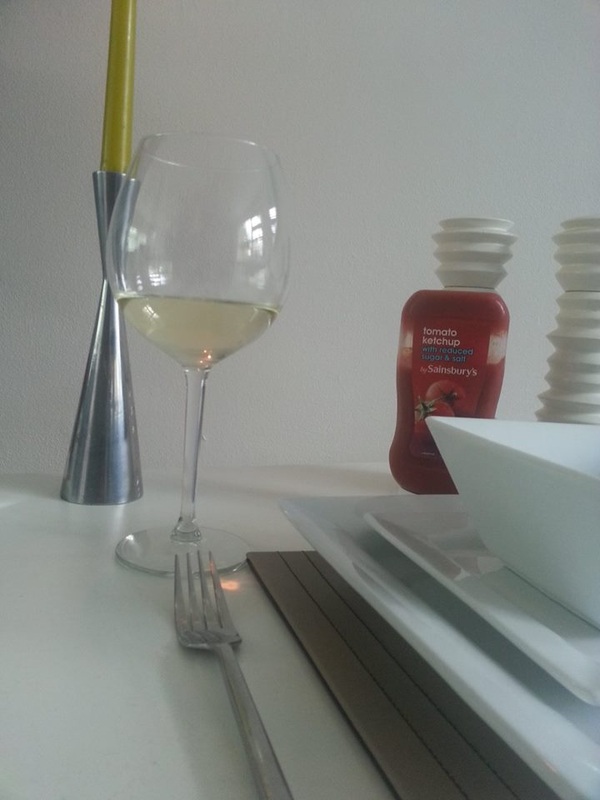
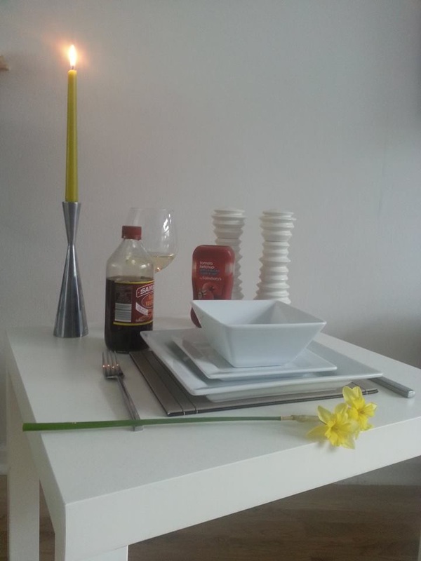
This is my favourite edit, I really like the kind of sketchy look to the edited photo on the right, the shadows are clear and the texture really works, the colours are vibrant and the reflection from the candle stick and the wine glass really bring out the best, the shadows on the plates look really good as it has many different shades of black, white, grey etc.
|

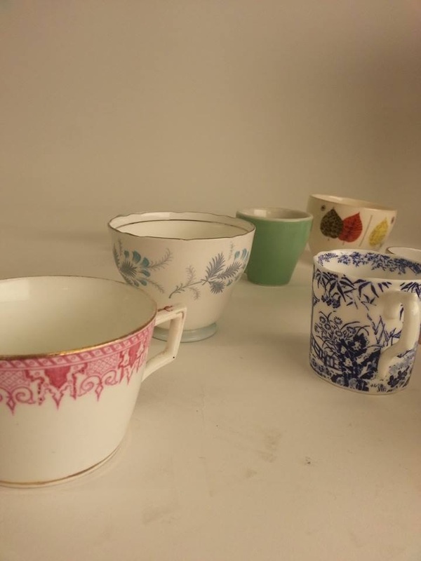
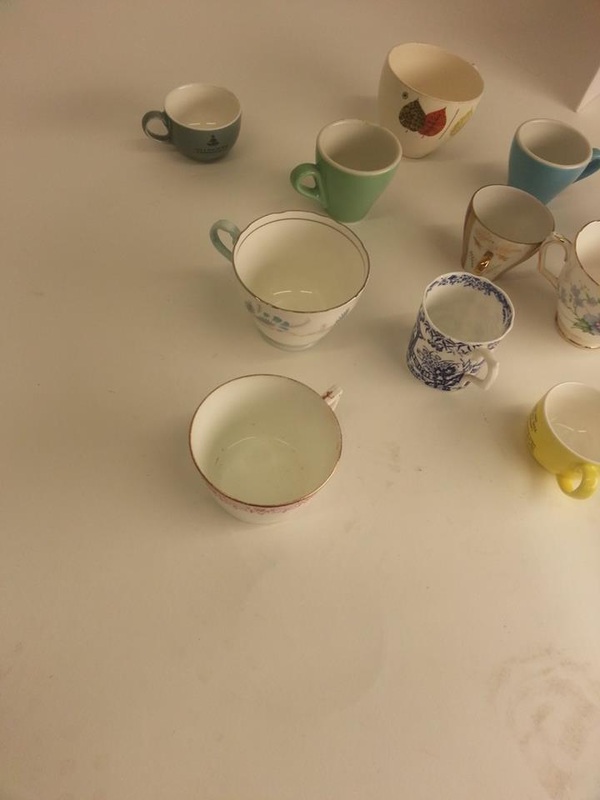
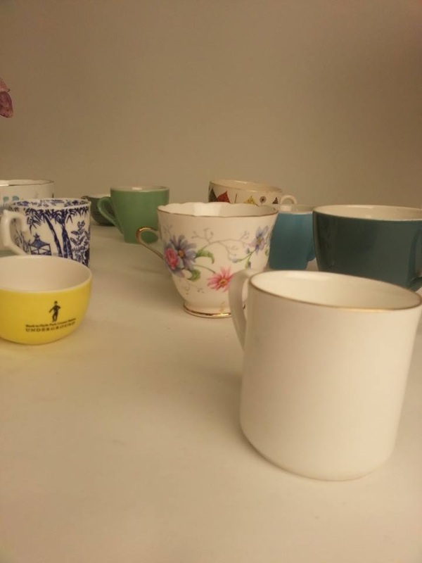
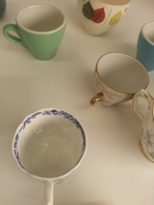
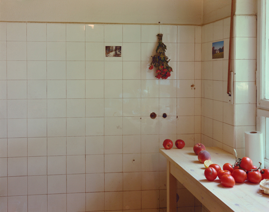
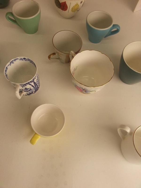
These are some photos that I've taken in school.
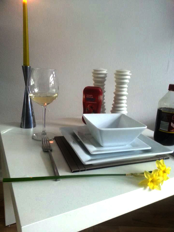
I took pictures of china cups, this was set out on a studio with a white back drop with studio lights white forms shadows, I really like all the colours or the china tea cups and all the different pictures on them.
I took pictures of china cups, this was set out on a studio with a white back drop with studio lights white forms shadows, I really like all the colours or the china tea cups and all the different pictures on them.
|
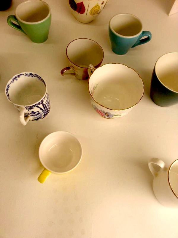
This was my favourite picture that I have taken, I like all the colours and it shows a lot of shadows from the cups and with the photoshopping, I darkened the shadows so that it was clearer to see, I think this turned out quite beautiful by the way it looks like an old photo, from many years back and it looks quite vintage. I would like to carry on with the cup ideas as it works really well.
|

|
|
|
|
These are some pictures that I took in the dark room I used the China cups and cutlery; knife, folk, and two spoons, some of them didn't really work out that well but some went perfectly, I used the tissue technique, this is when you put a tissue in the stopper chemical and place it on to the light sensitive paper and it left with little tissue grains on it which I think looks quite cool. I also splattered the chemicals on the paper with a paintbrush which also looks really good! I would like to carry on with some of these with new objects that I'm going to use on the last 5 hours of exam day 2. |
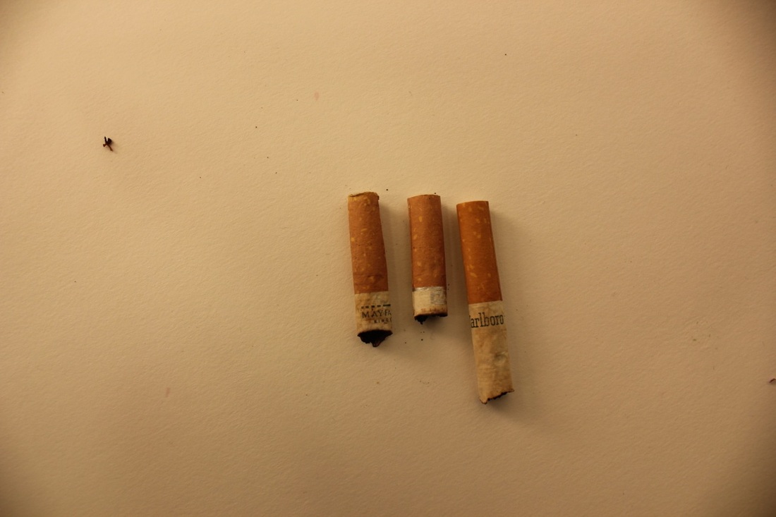
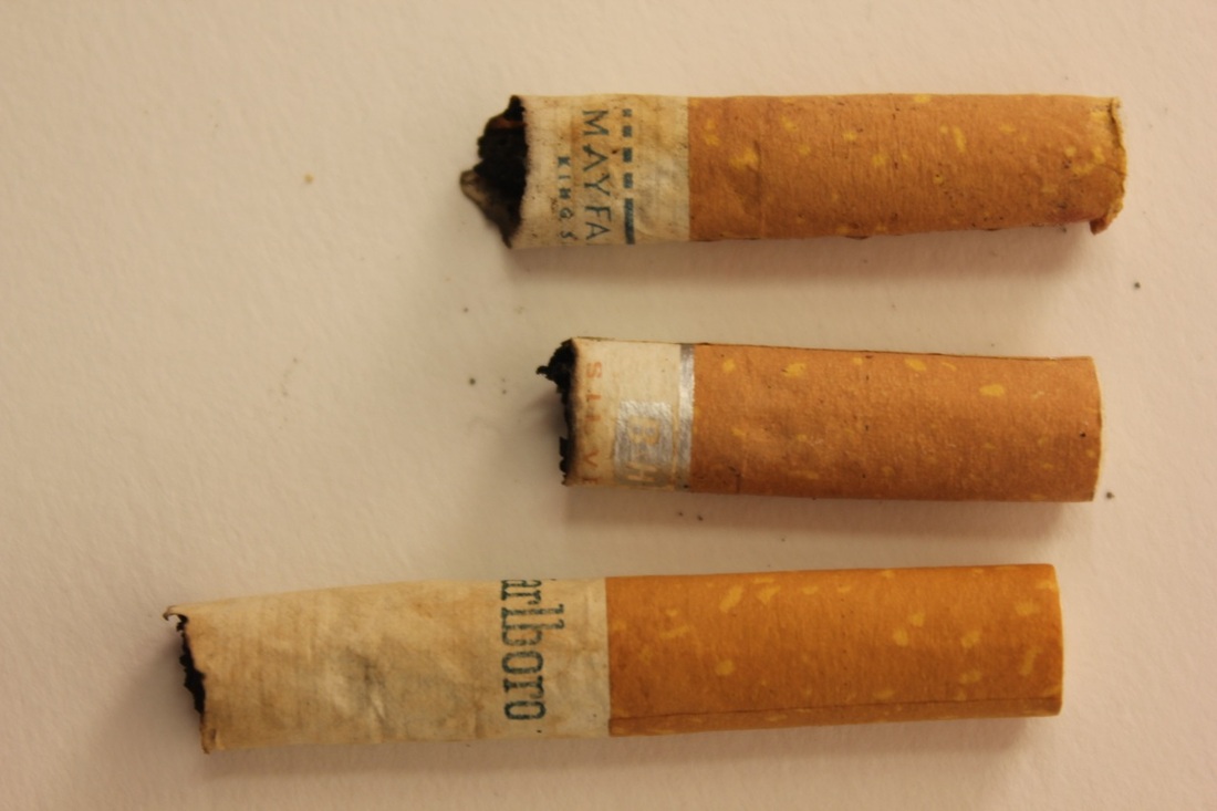
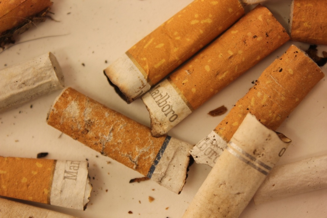
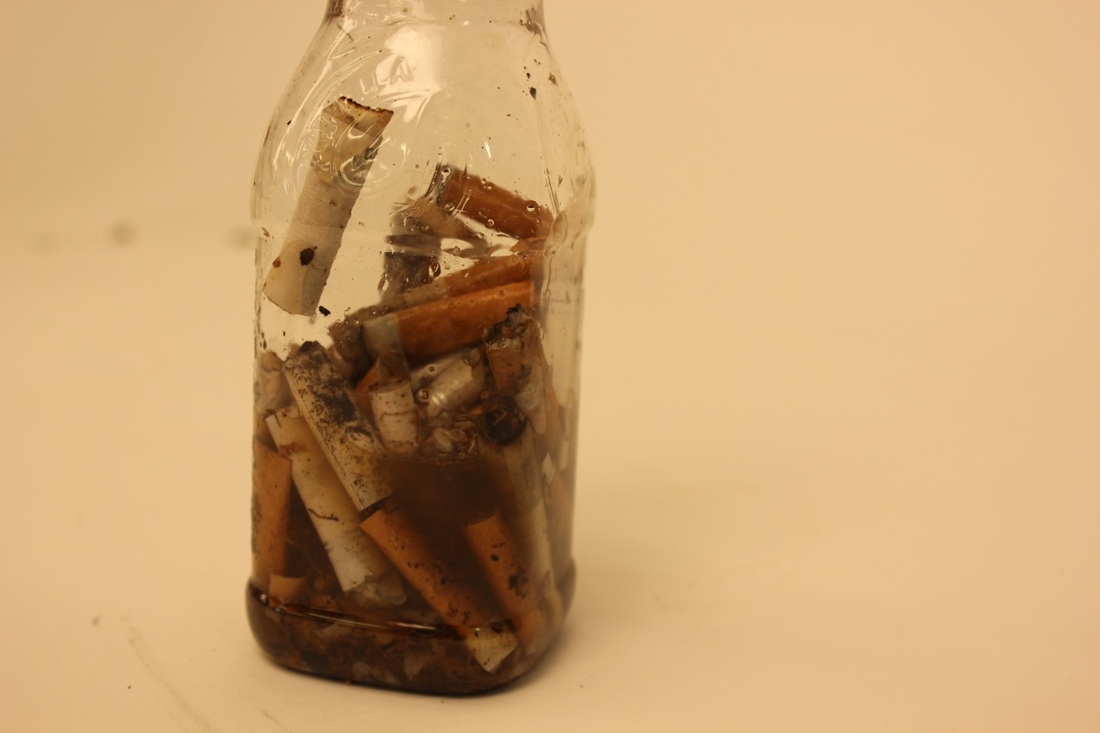
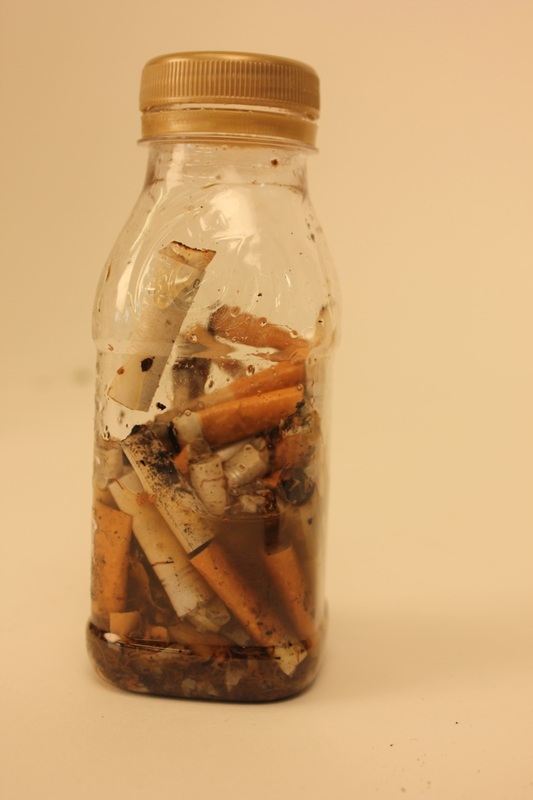
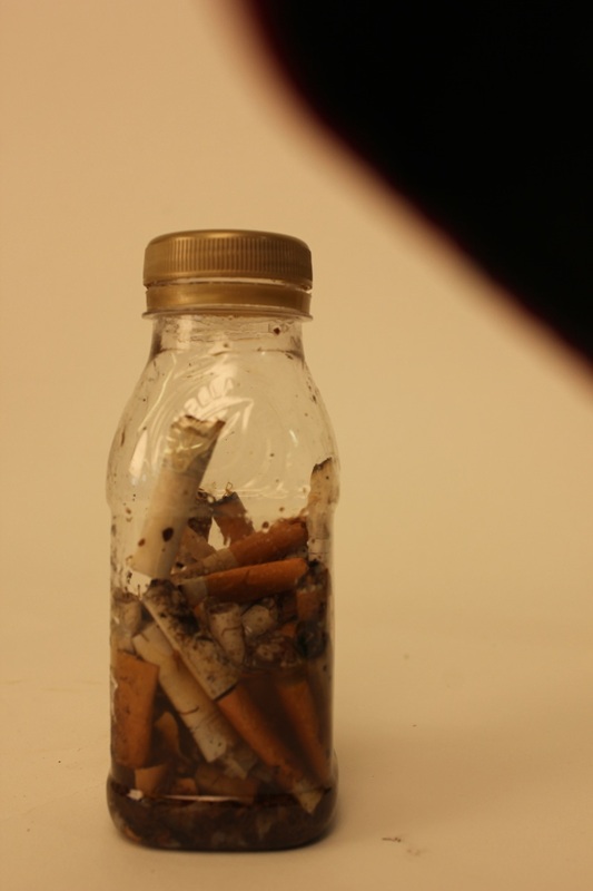
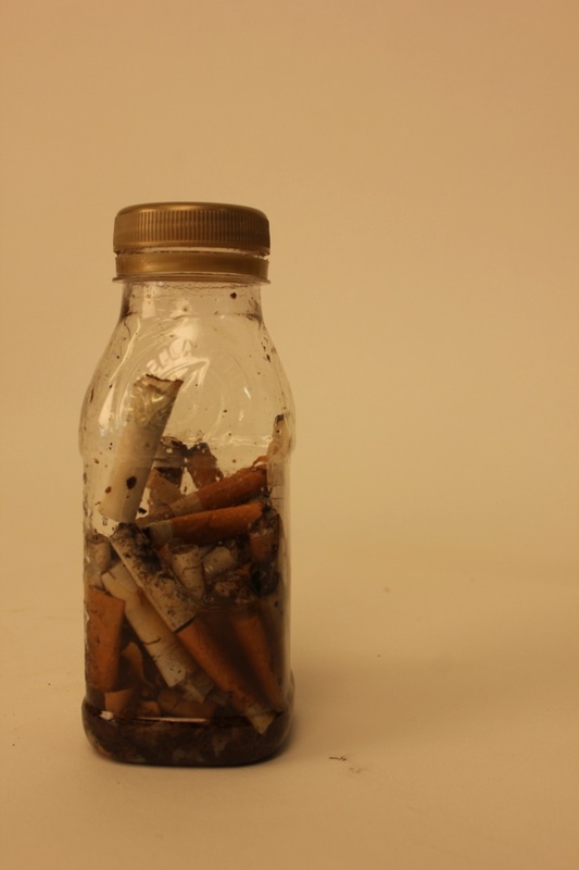
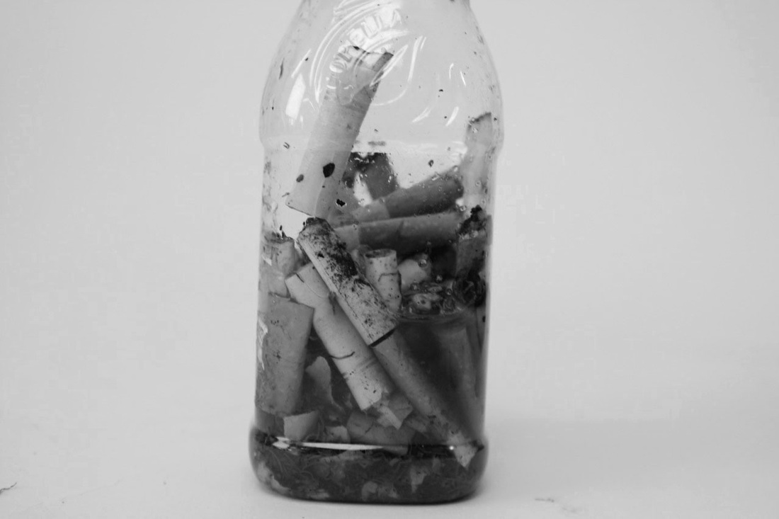
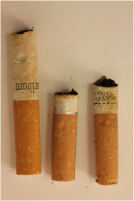
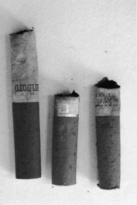
Irving Penn.
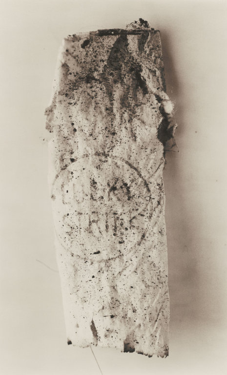
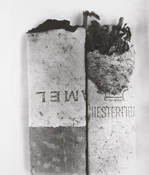
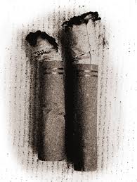
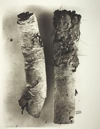
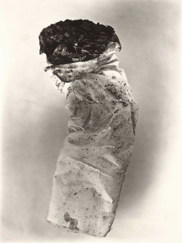
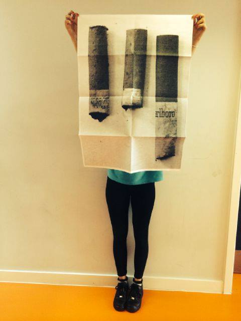
Cigarettes.
This is Irving Penn's still life work, this is to do with cigarettes that he has either smoked or found on the floor.
I think this is a really good idea as it's different and its strangely disgustingly fabulous. I am going to find cigarettes on the food and gather them all together to take pictures and to use them in a dark room to use on light sensitive paper, I am also going to put them into a bottle of walker so I can see the change in colour and how it reacts in watcher, also with the light reflecting in the water it will look really good.
I think this is a really good idea as it's different and its strangely disgustingly fabulous. I am going to find cigarettes on the food and gather them all together to take pictures and to use them in a dark room to use on light sensitive paper, I am also going to put them into a bottle of walker so I can see the change in colour and how it reacts in watcher, also with the light reflecting in the water it will look really good.
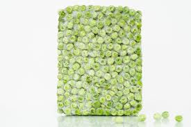
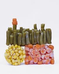
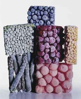
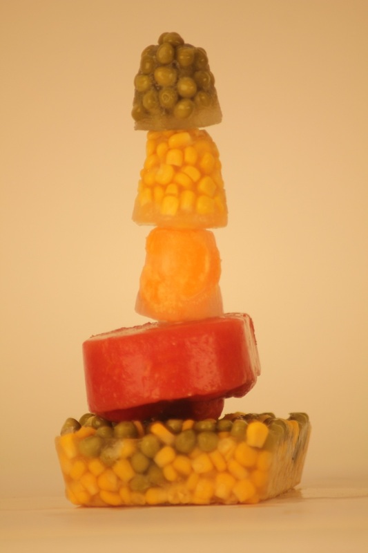
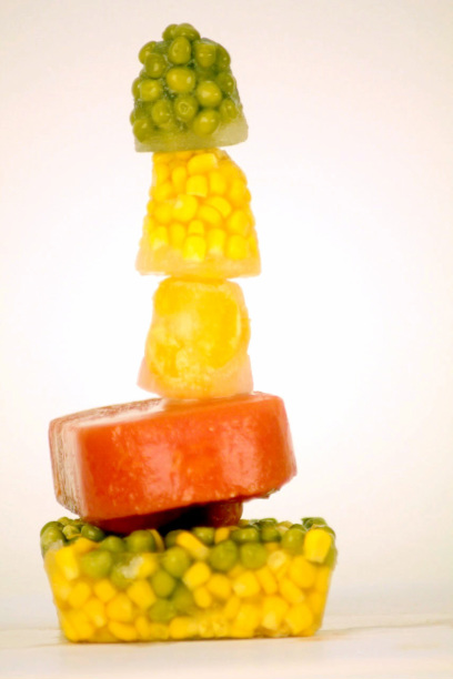
Iced food.
This is another thing that Irving Penn has done, this is frozen fruit and vegetables, I really like this because of all the colours and shapes of them, I would like to try this out with maybe peas and sweetcorn. maybe even with fruit like bananas and oranges maybe apples. I like the textures and shapes and sizes. Would even be a good idea to do a stop motion video of it melting and coming back to life, but may save this for another time.
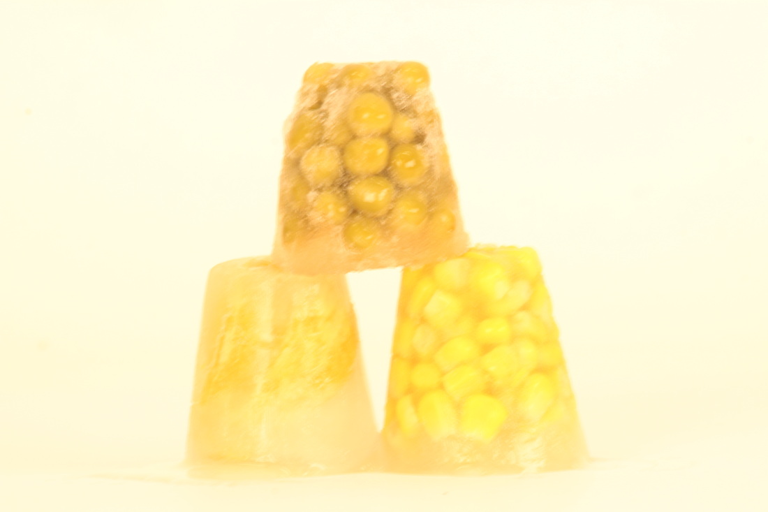
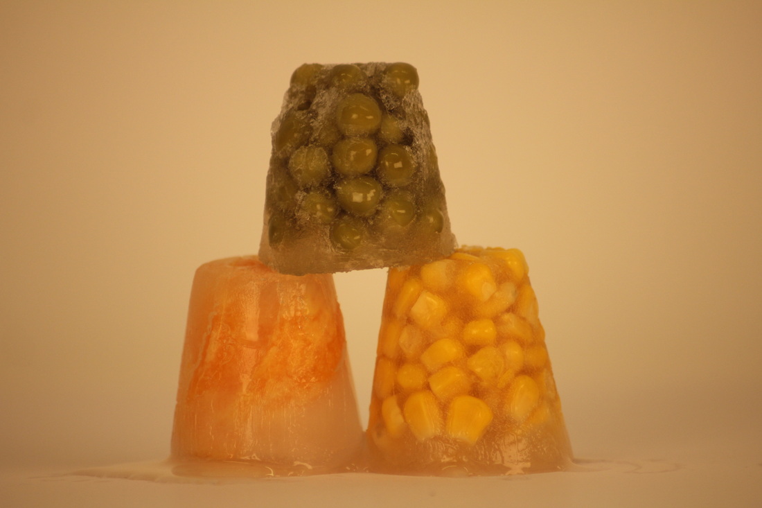
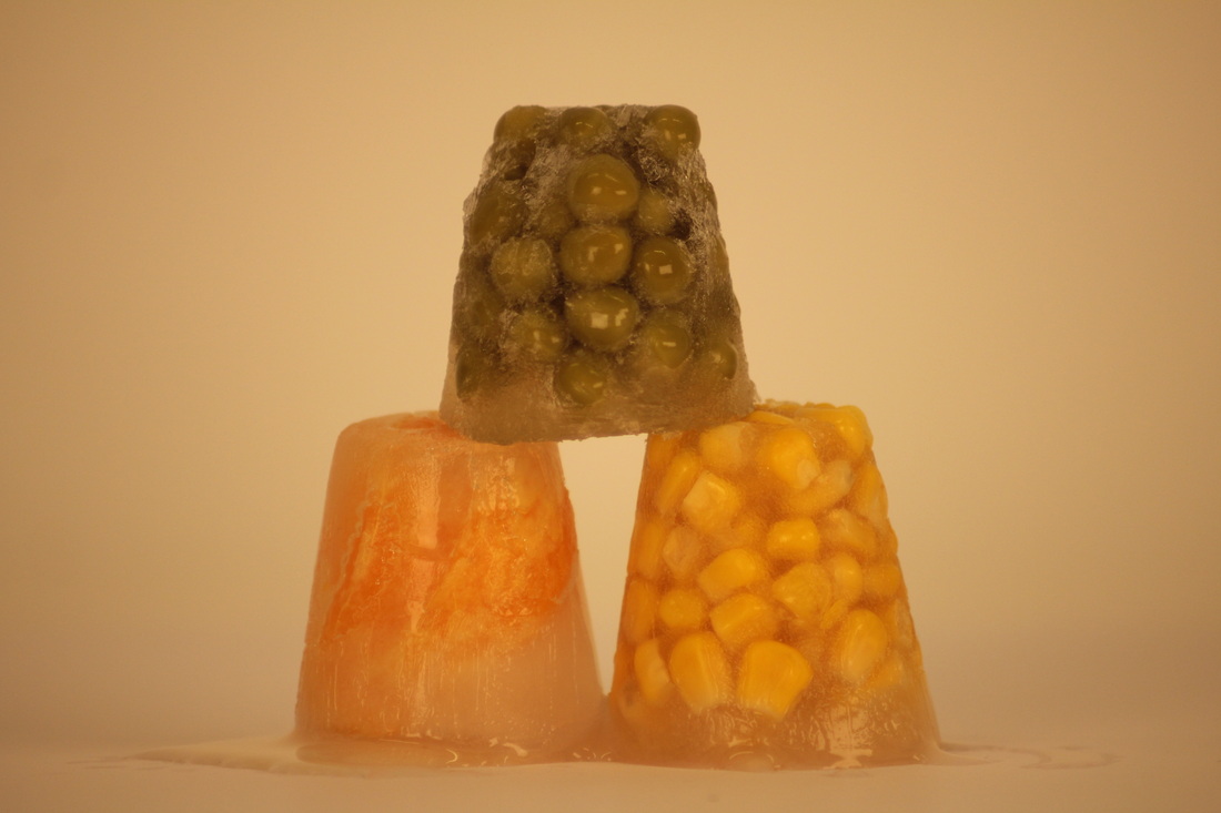
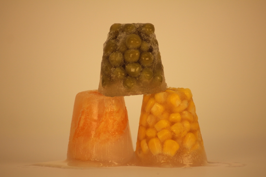
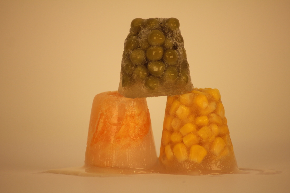
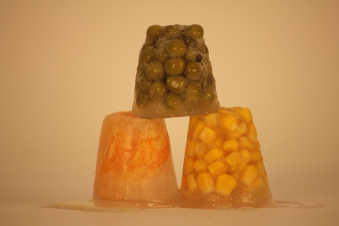
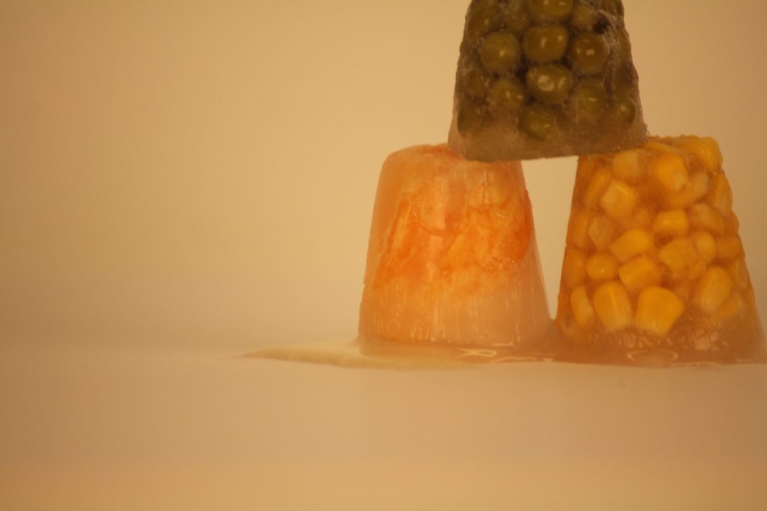
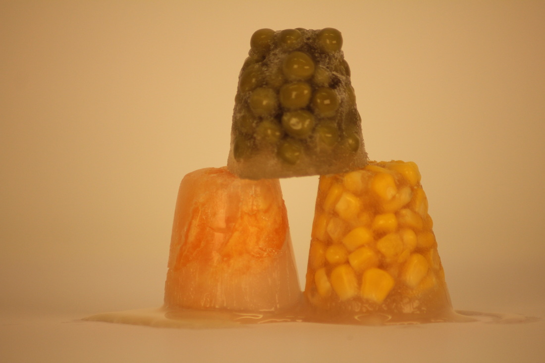

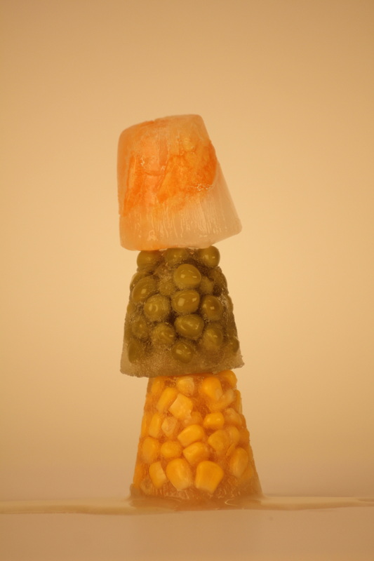
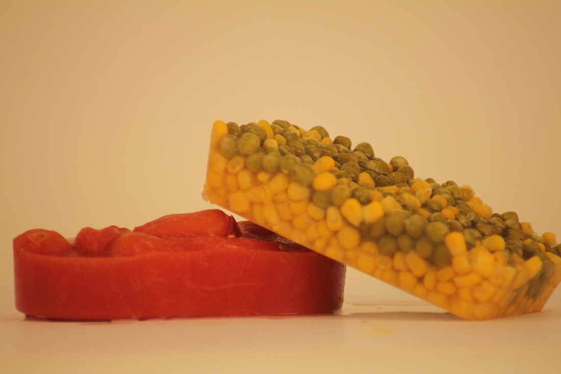
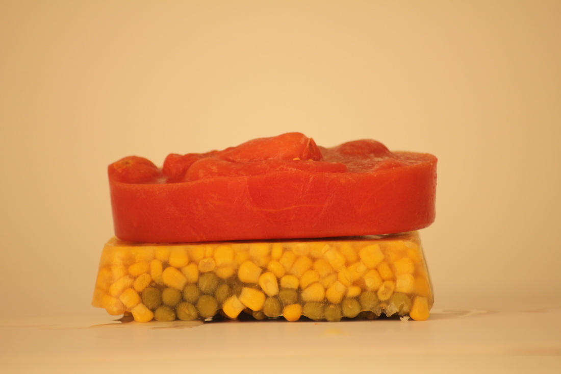
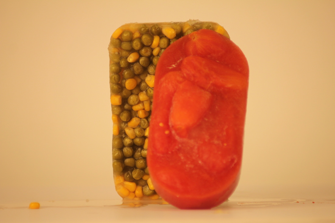
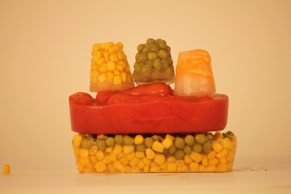
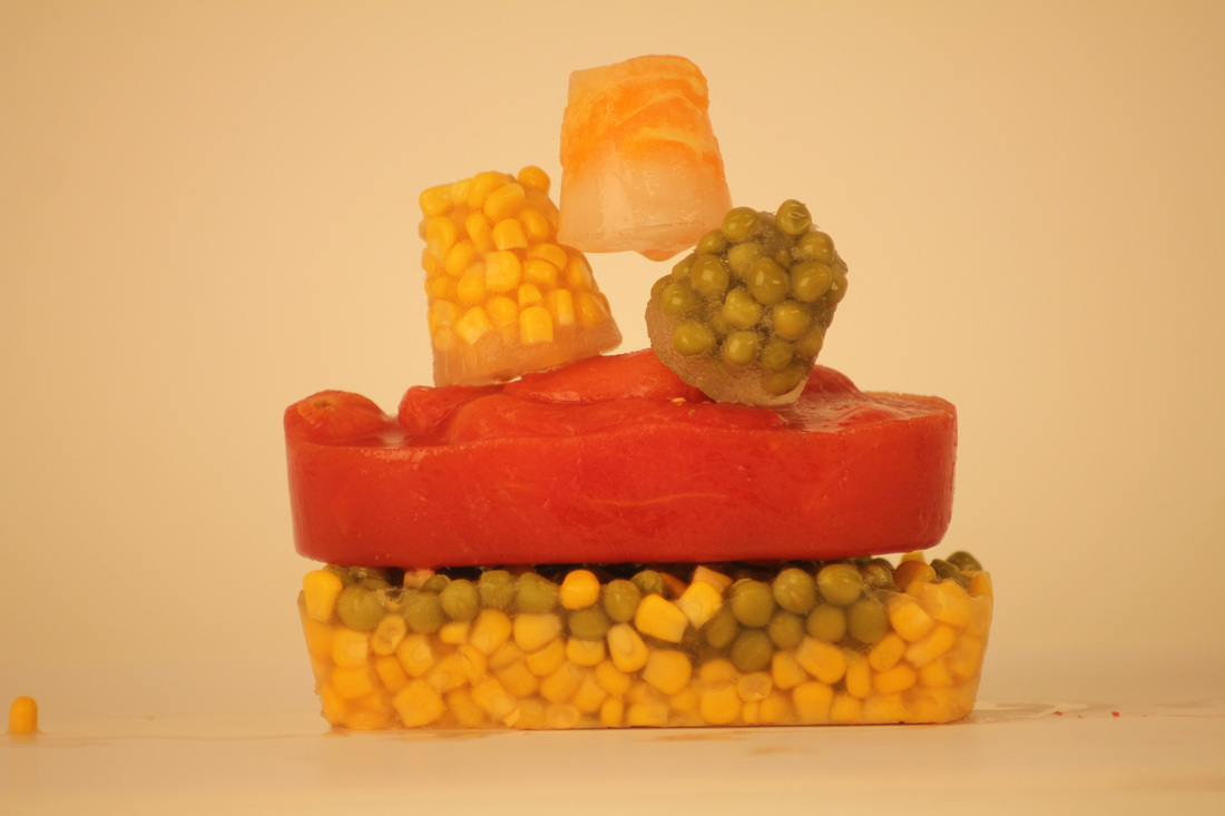

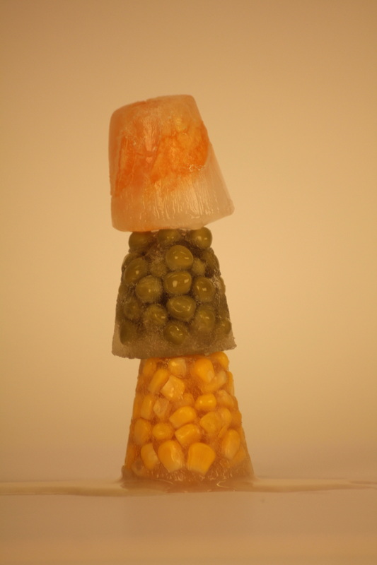
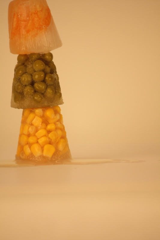


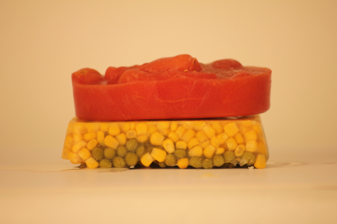
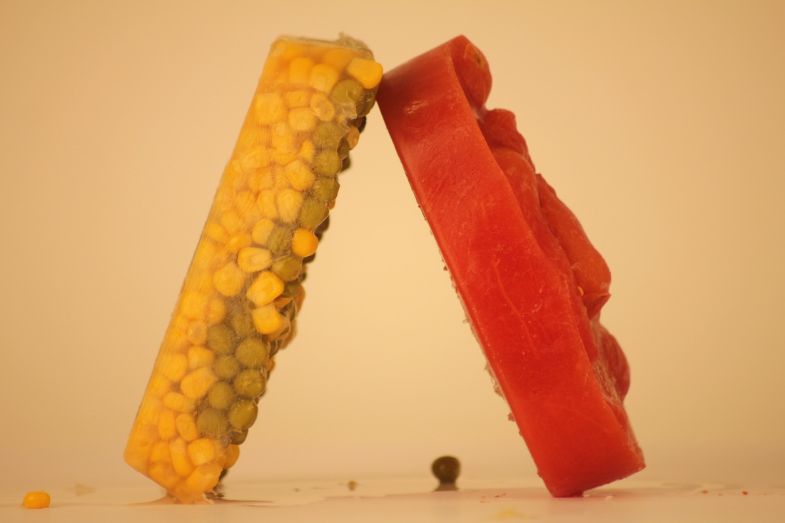
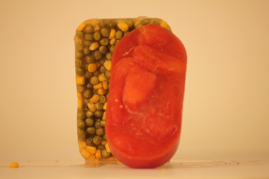
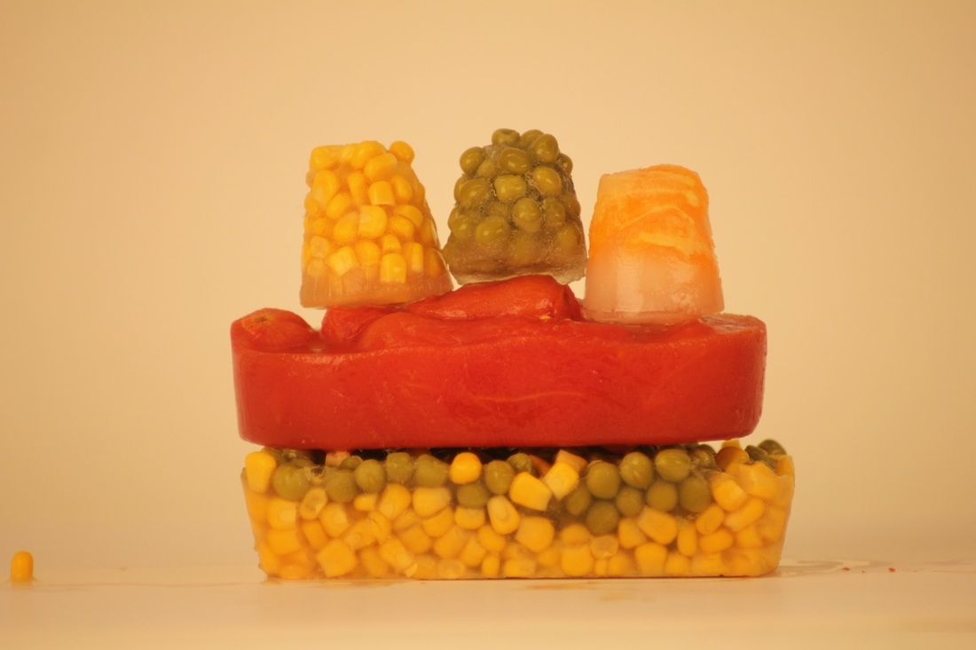
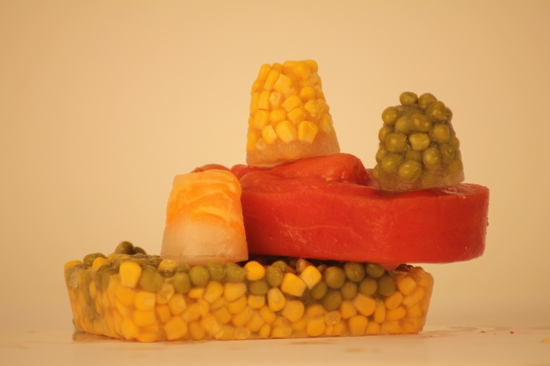
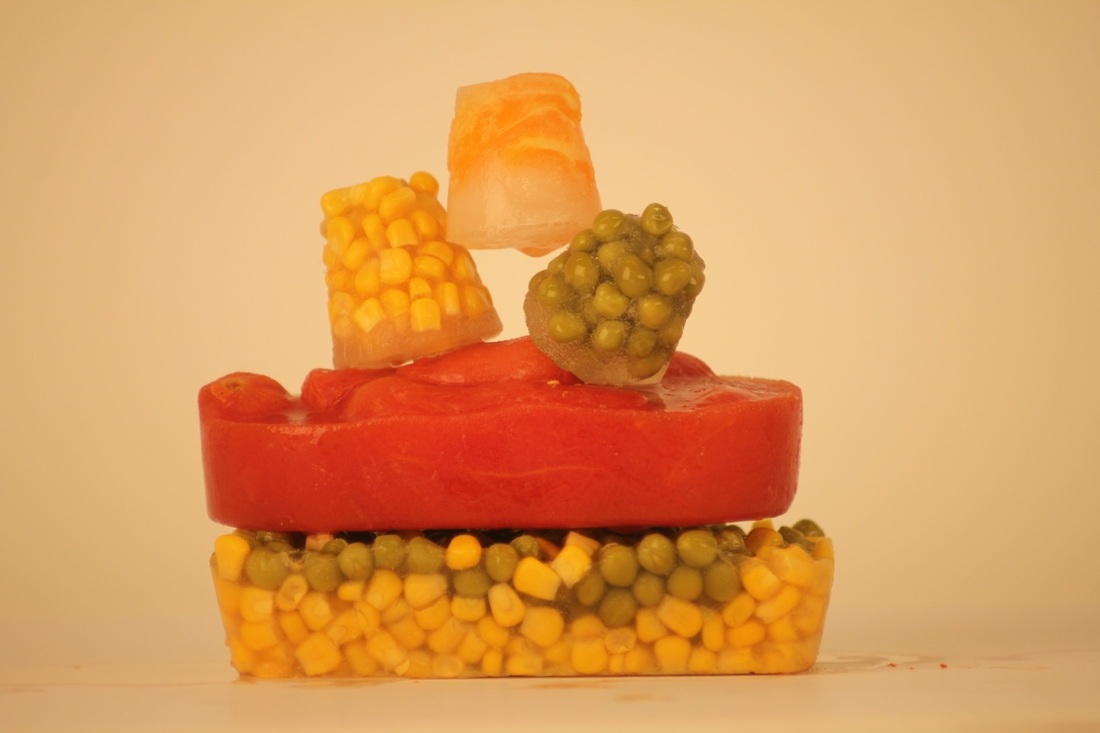
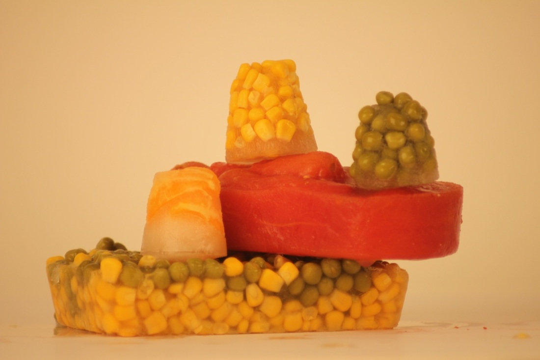

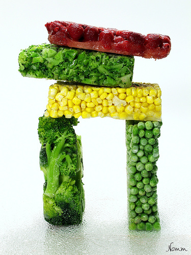
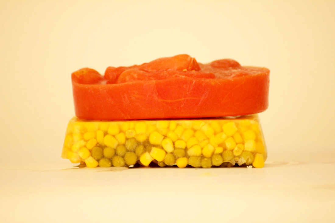
These are some pictures that I have taken in school, this are frozen vegetables and fruit, this is used with oranges, tomatoes, peas and sweetcorn. I place them in shot glasses and tubs and added some water. This turned out quite successful with it not melting to quick and also the way its easy to handle. I find that this had turned out the way I wanted it to as of the way Irving Penn has done it as it's his sort of style of arrangement.
|
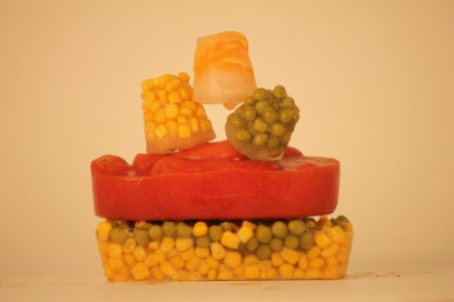
This is the first photo that I have photoshopped. I really like the way the colours have brightened out as I have brightened up the contrast. With the white background as well really makes it seem more of what you see from your eyes rather then just what you see from a picture.
|

|
A tiny bit of editing in this picture, mostly brightened the contrast.
|
|
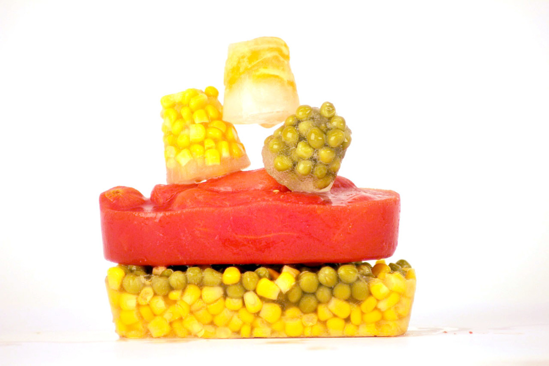
This is my favourite, The colours are really bright and beautiful and it's really eye catching.
I am going to use this for my final piece as I think this is the best one. |
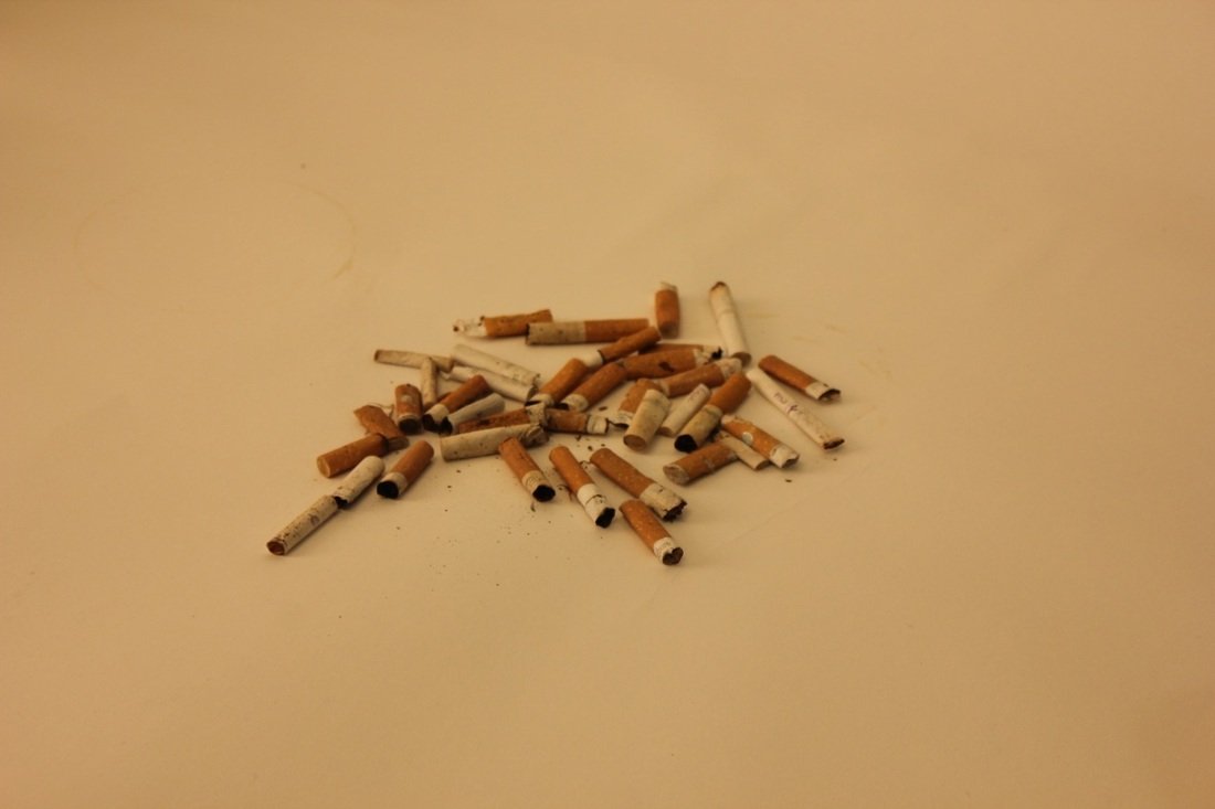
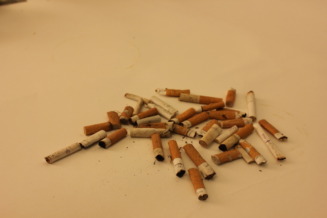
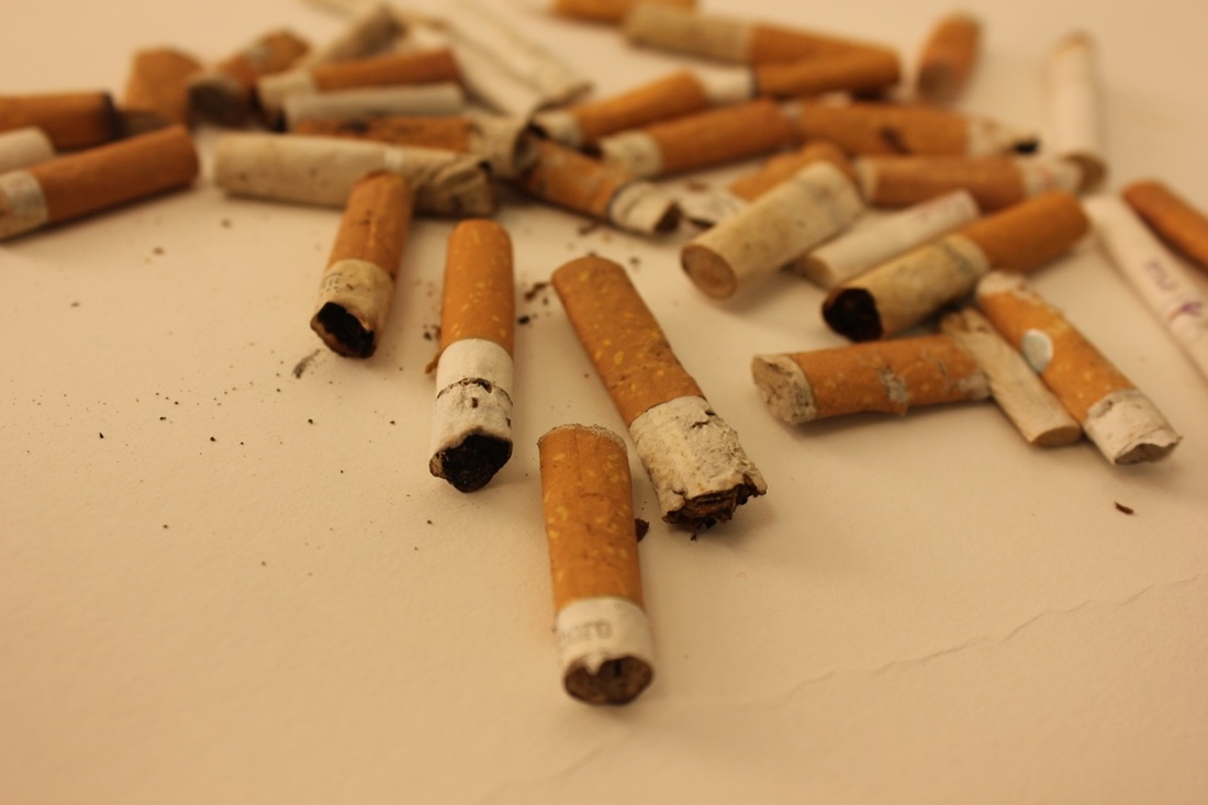
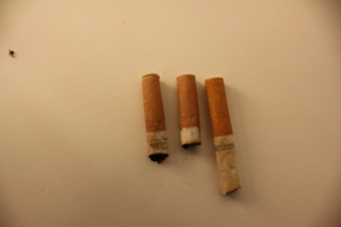

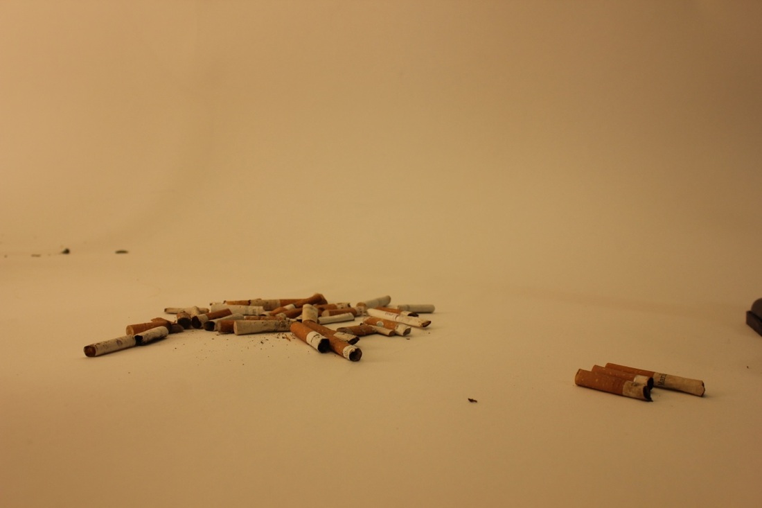
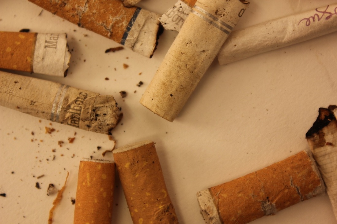
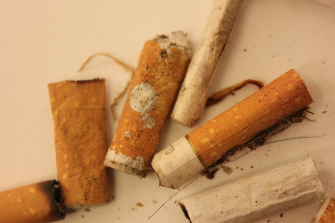
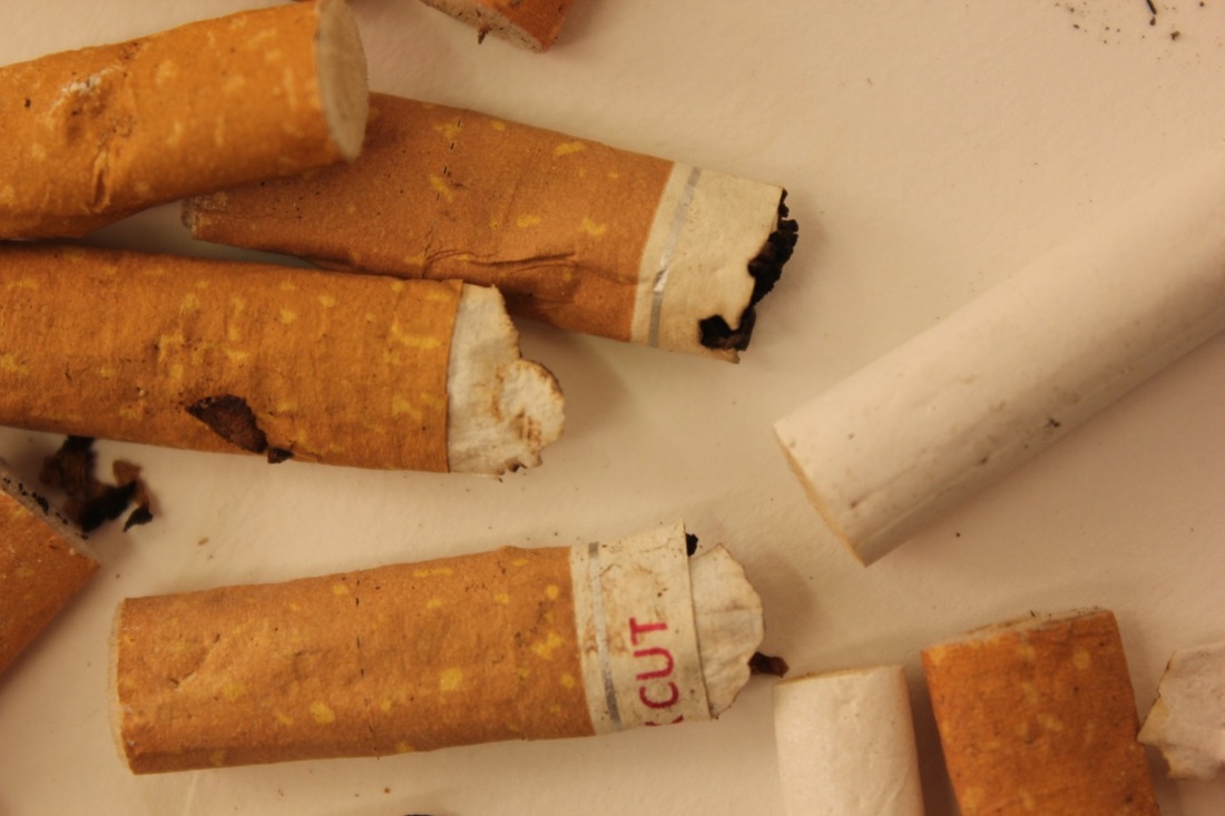
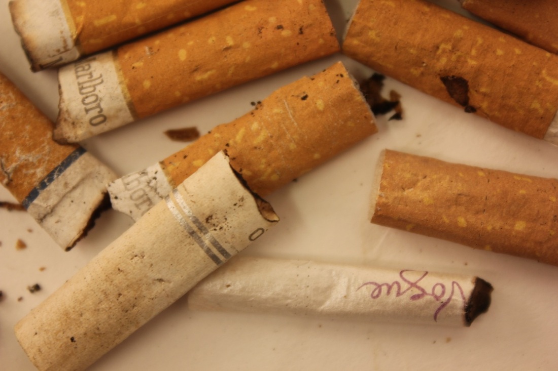
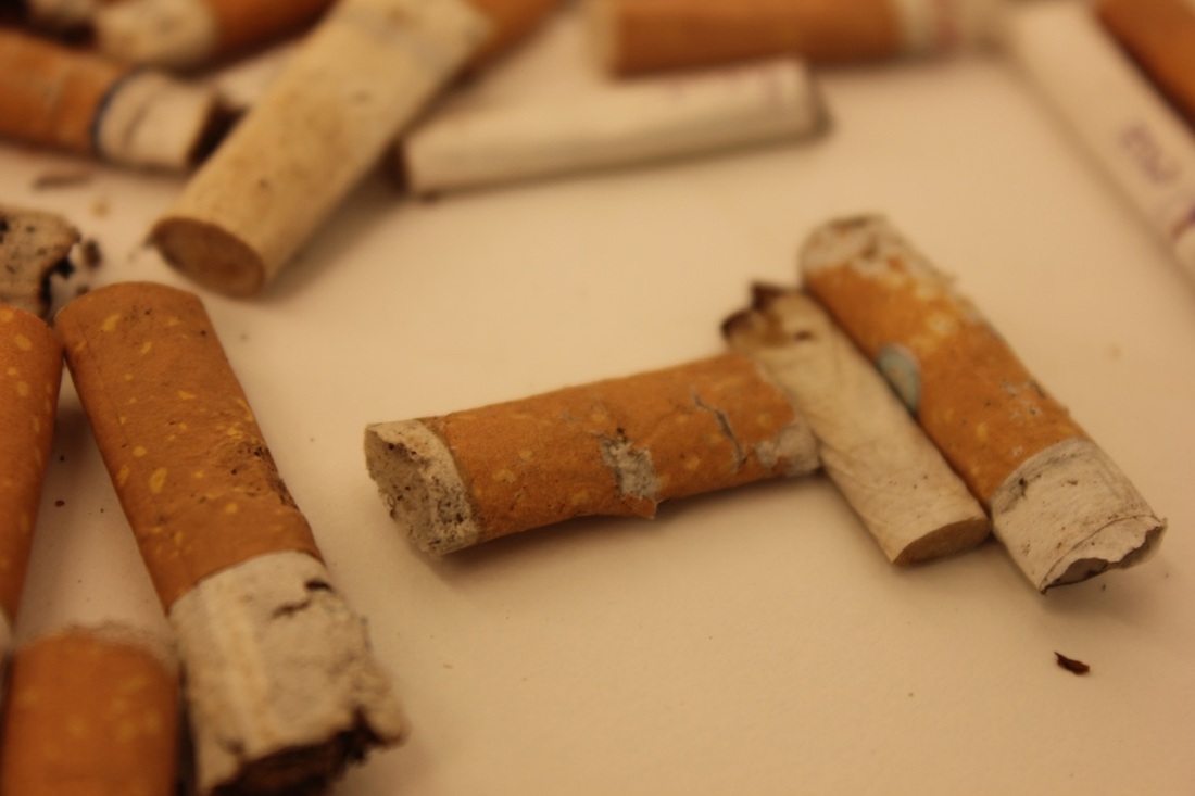
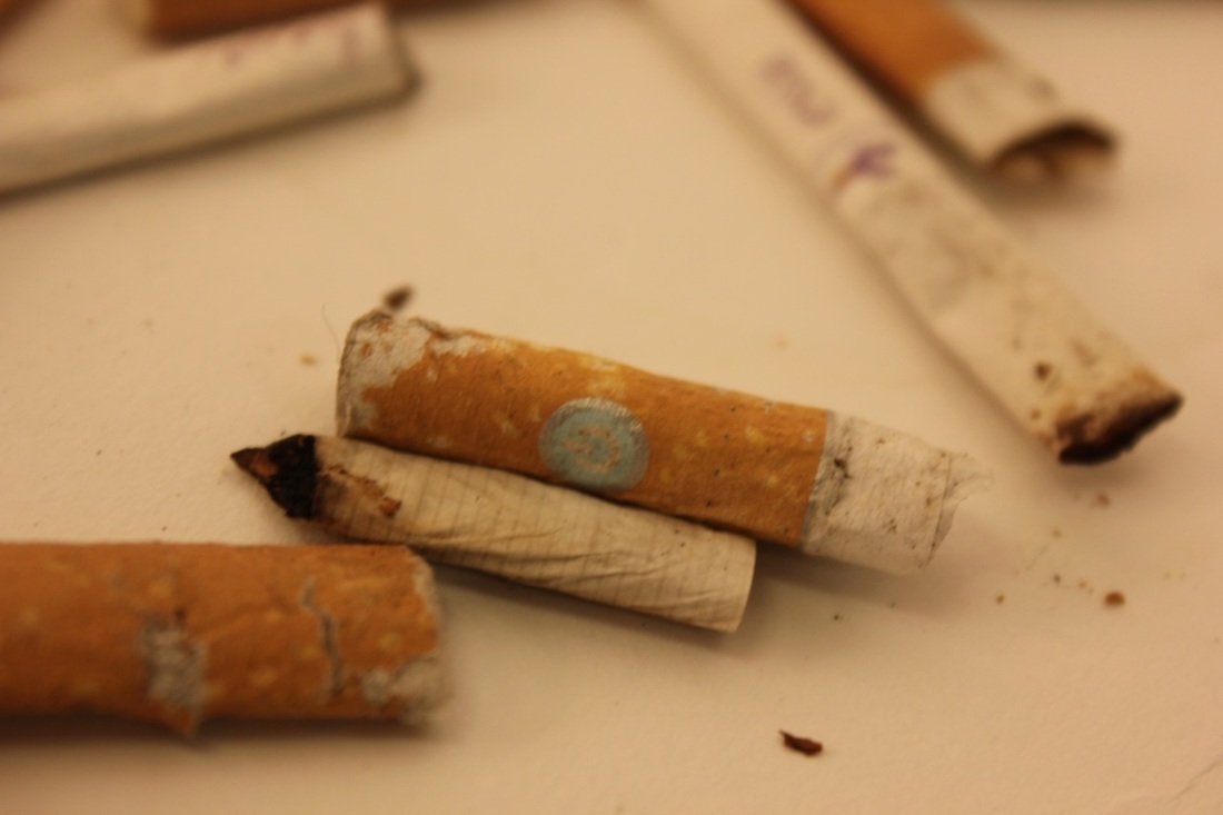
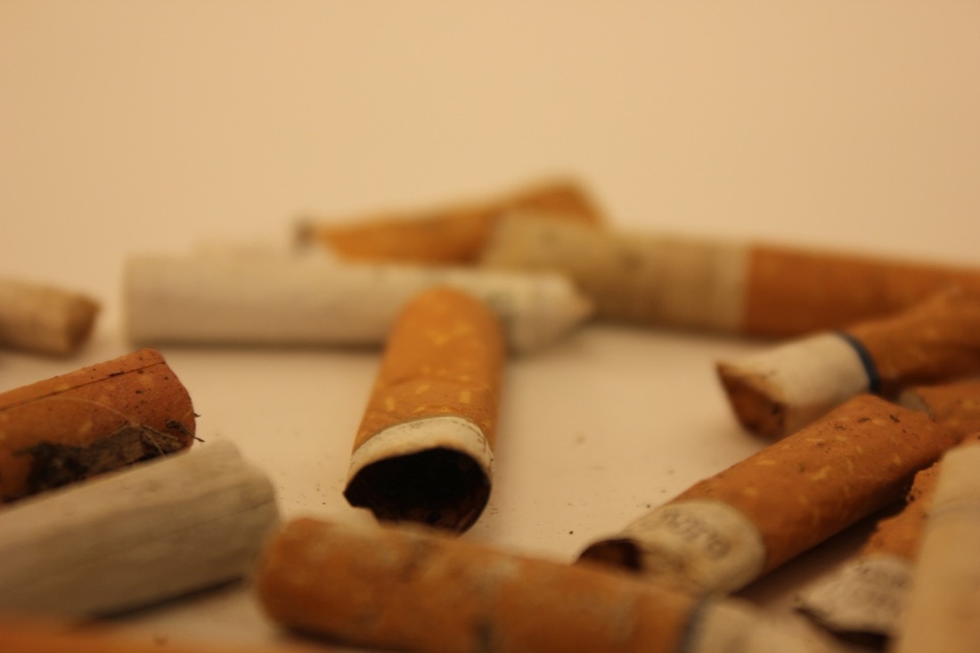
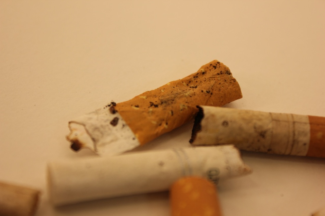
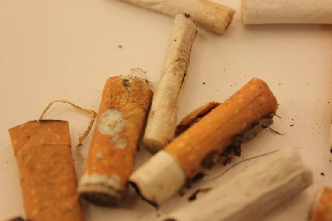
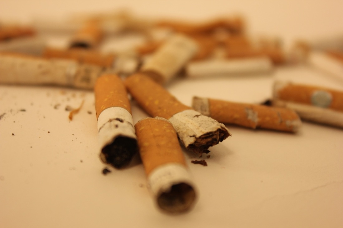
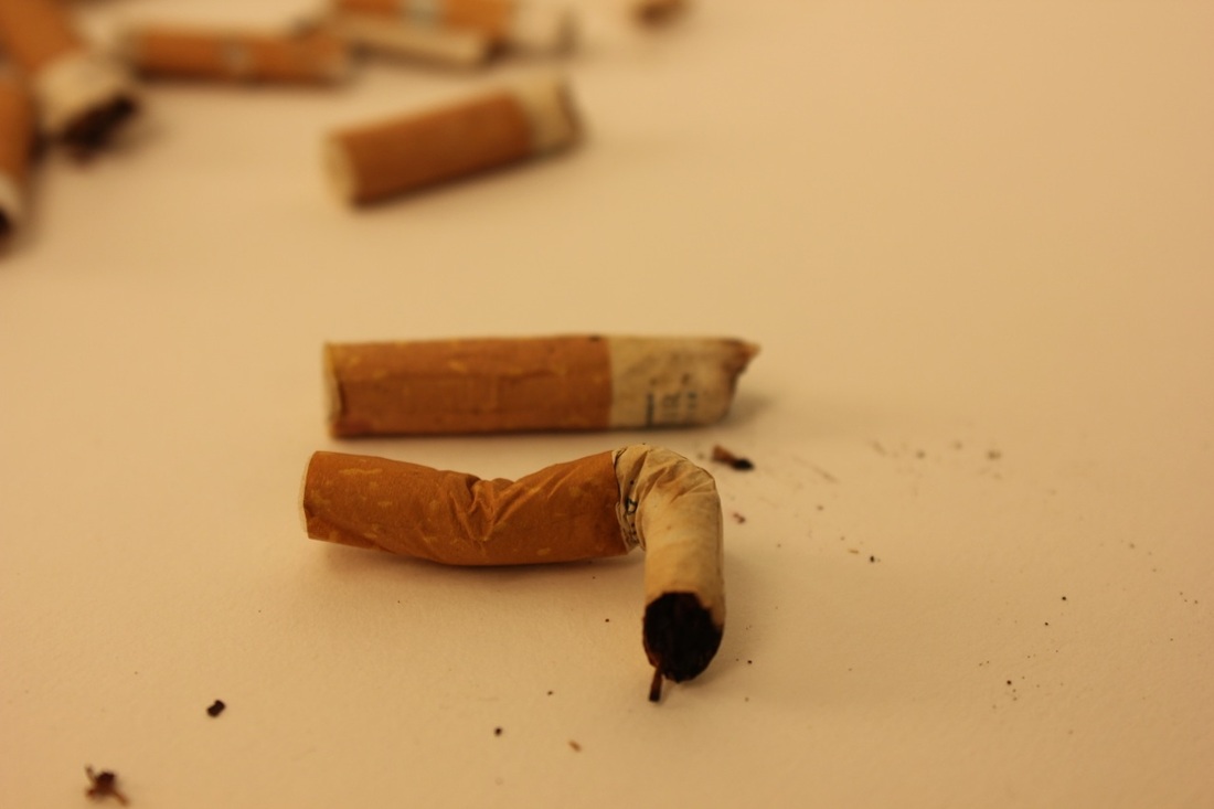
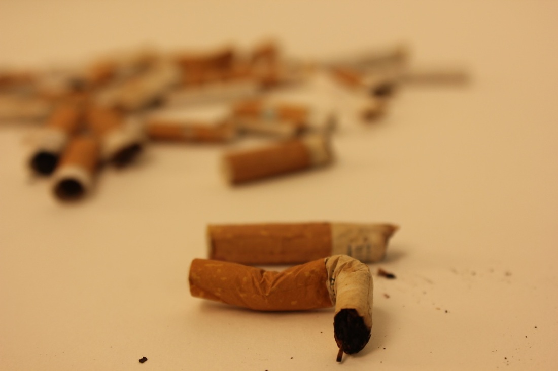
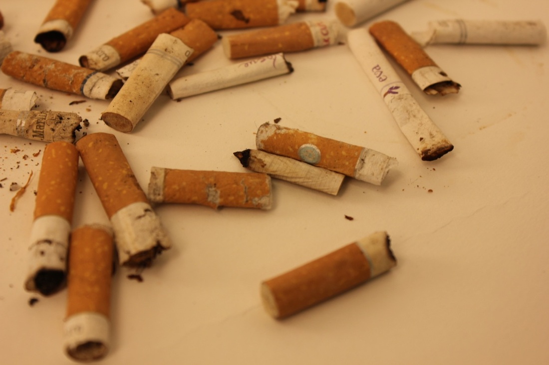
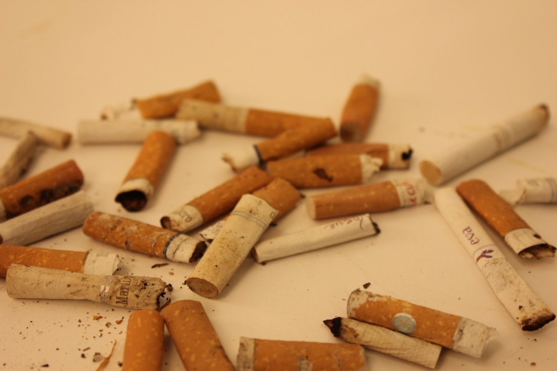
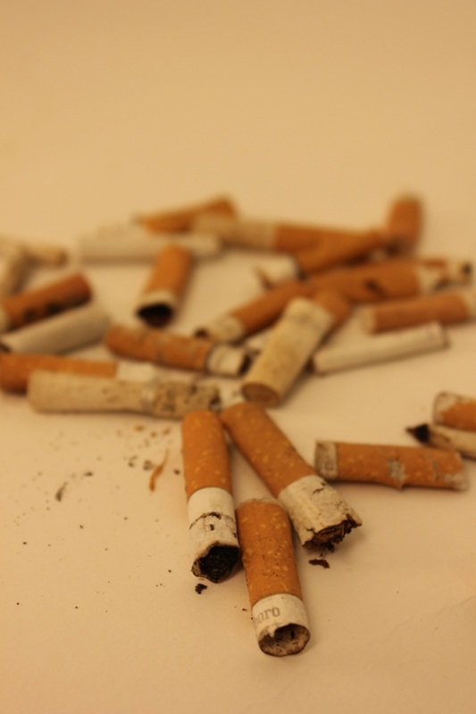
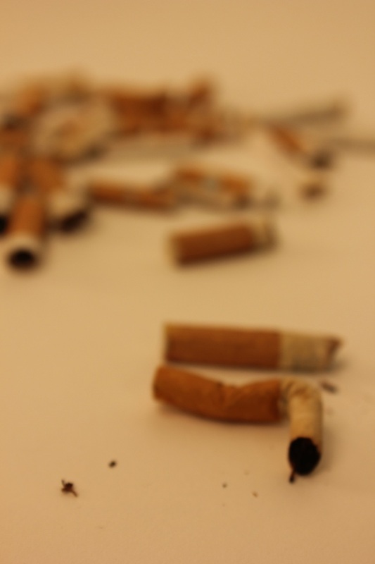
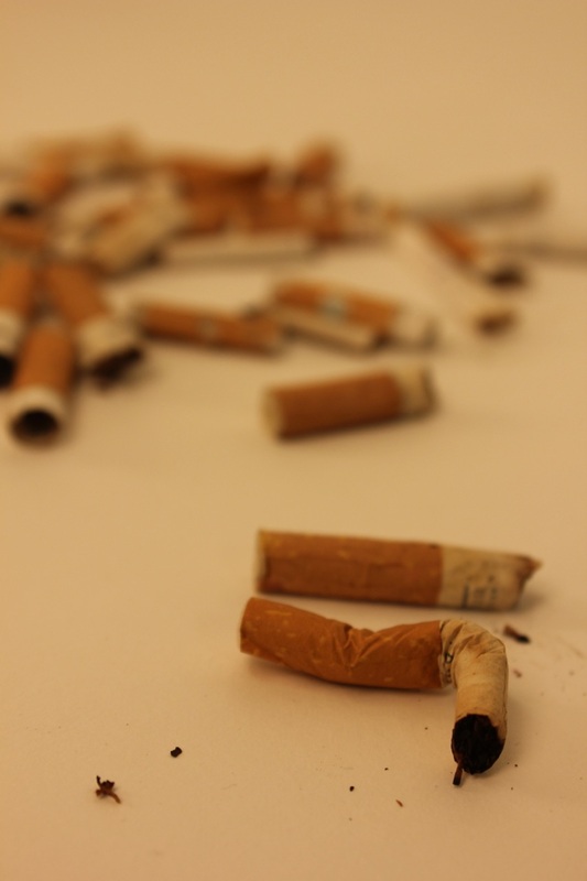
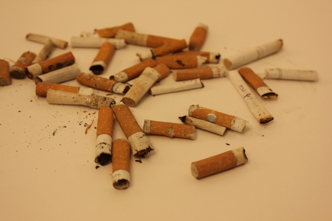
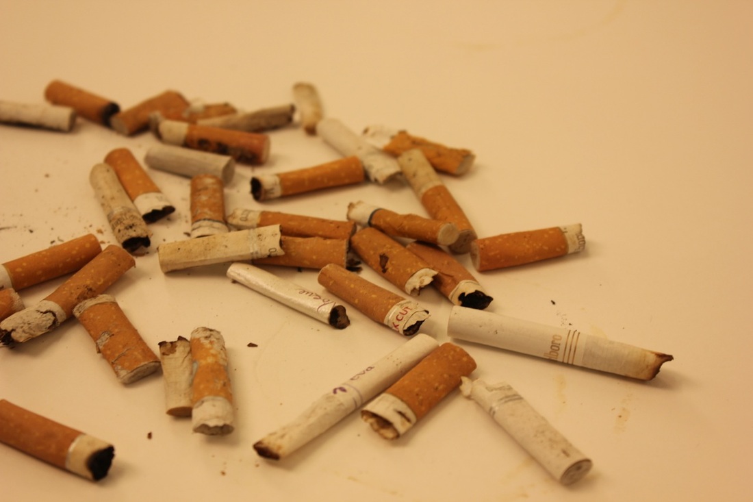
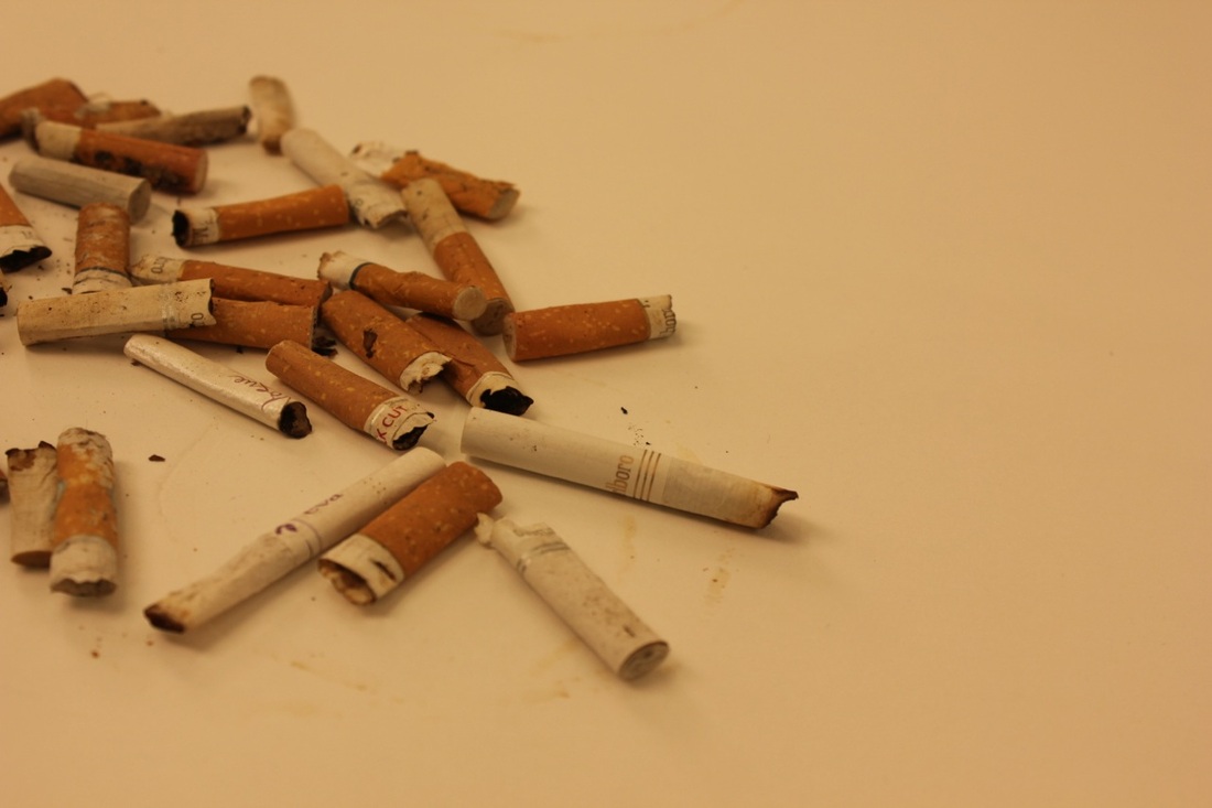
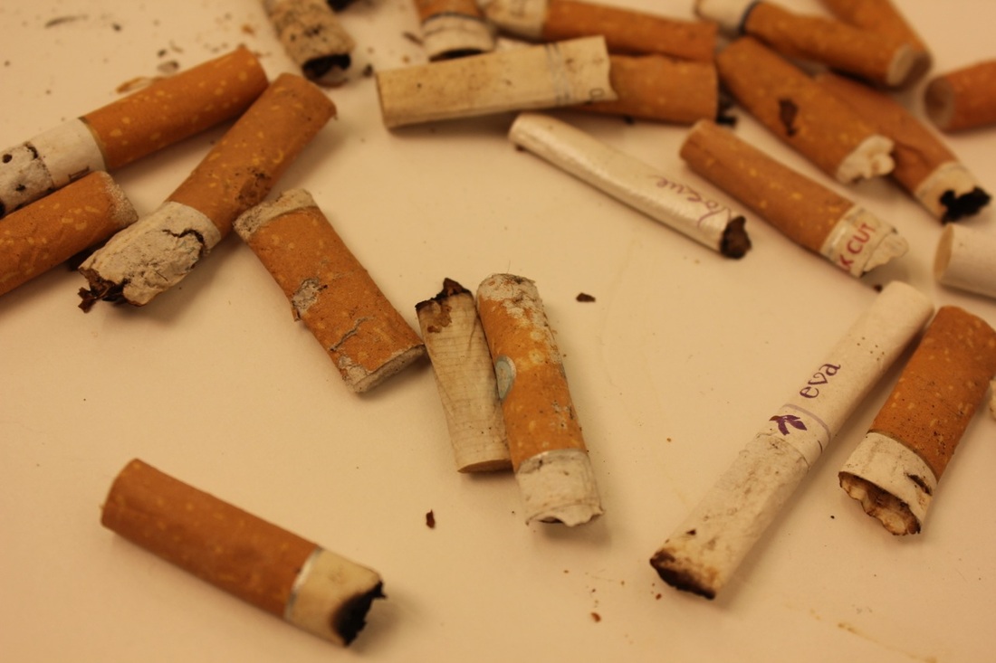
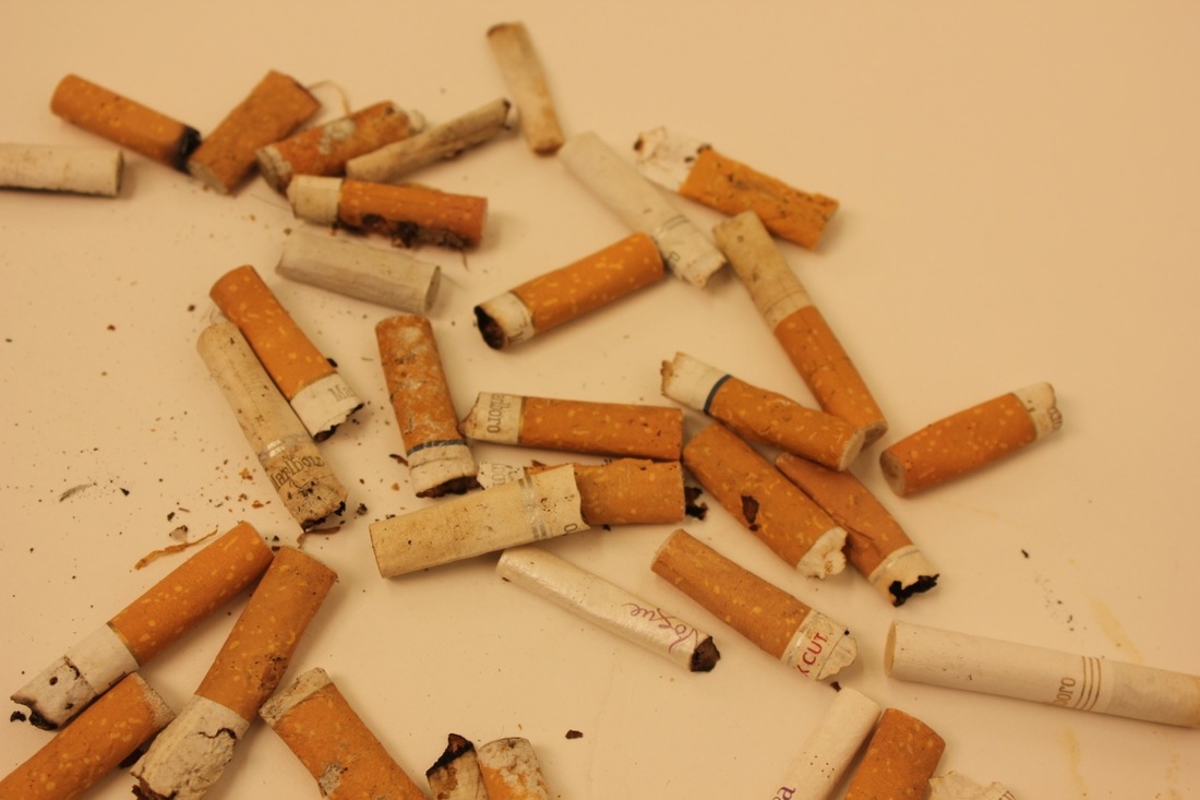
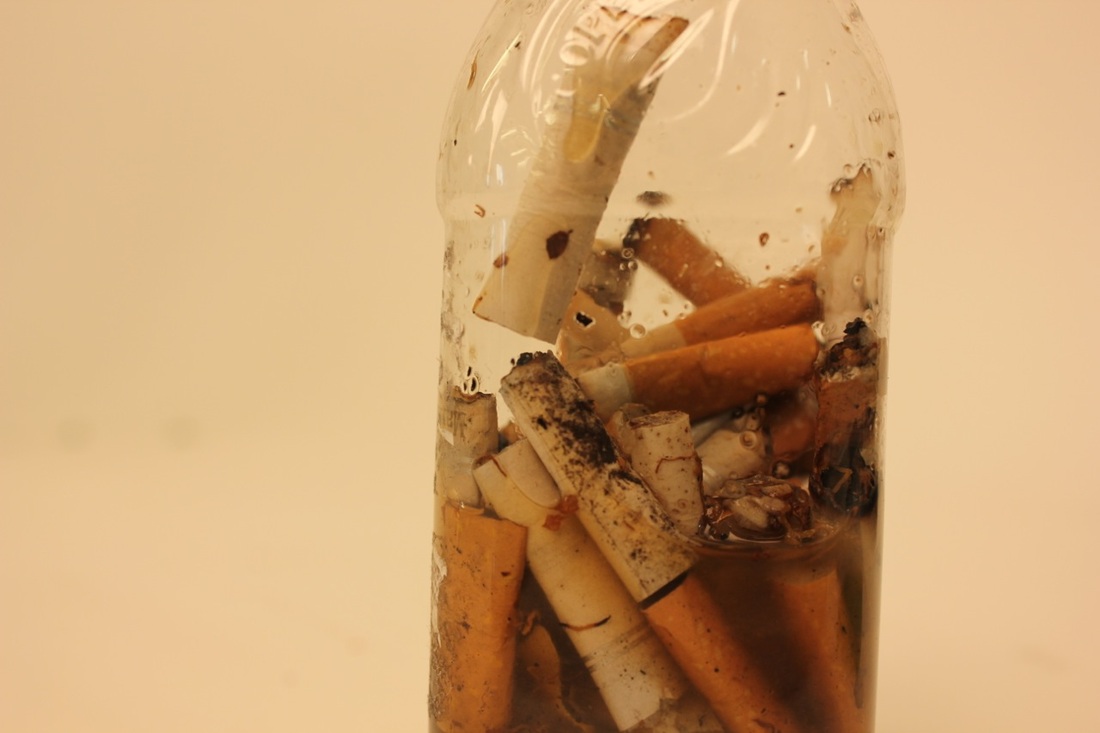
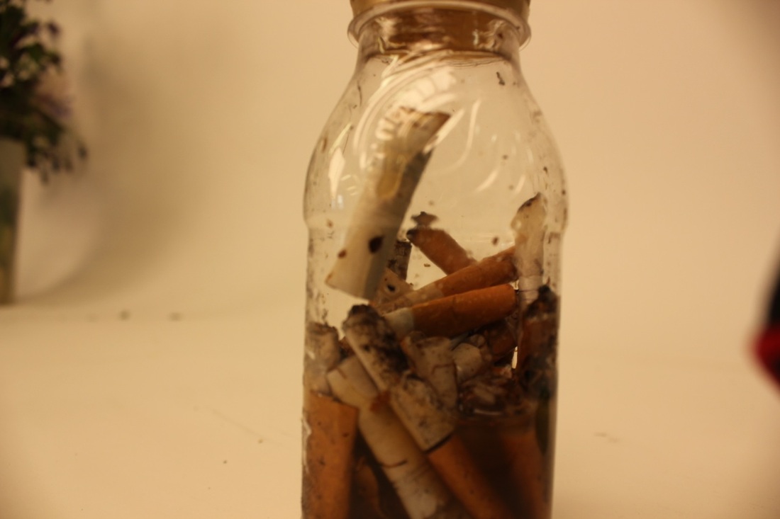
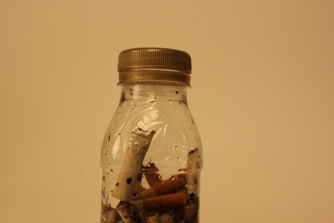
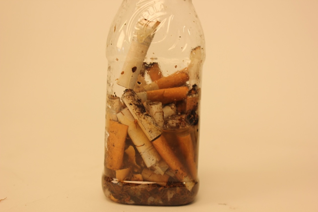
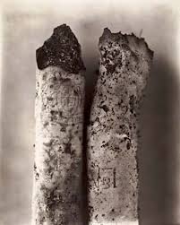
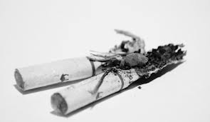
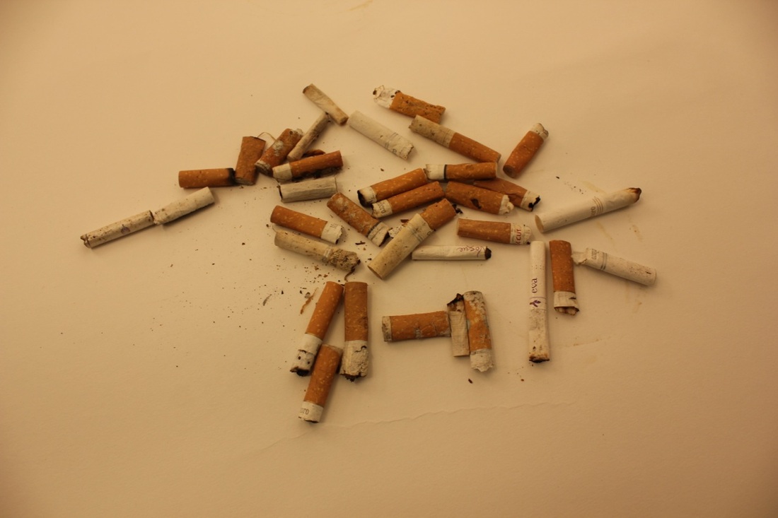
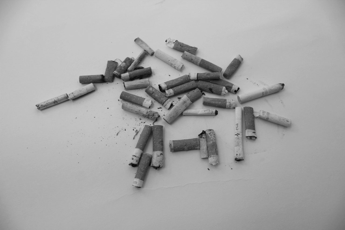
These are my pictures of cigarettes from inspiration from Irving Penn, I think these turned out quite well. I like the dirty-ness of the cigarettes from how grotty and horrible it is which makes it look quite beautiful, especially with the plain background it really stands out.
|
Another picture which I have edited.
|

|
.. Another one..
|
|
This is my favourite one, I like all the light shades and dark shades.. I am hoping to use this for my final piece.
|
MY FINAL PEICE.